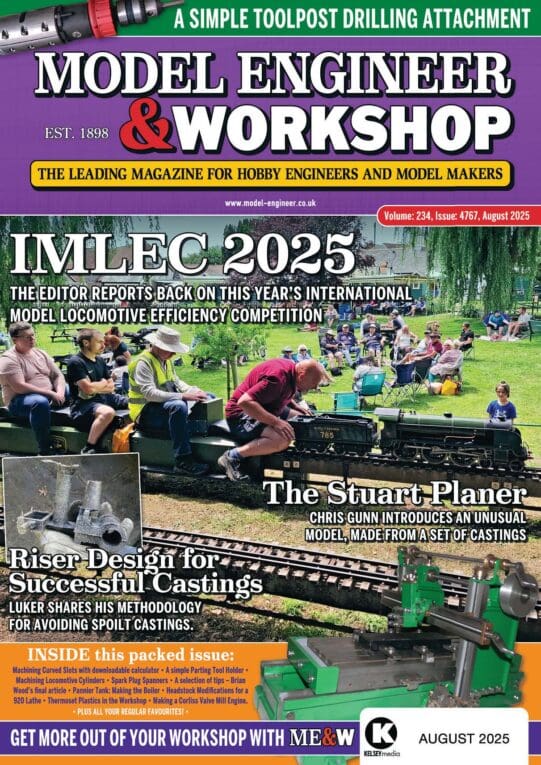
Workshop Photography Articles

Advert

Workshop Photography Articles

Home Forums Model Engineers’ Workshop. Workshop Photography Articles

Viewing 19 posts - 1 through 19 (of 19 total)
  • Author
    Posts
  • #637742
    James Tregaskis
    Participant
      @jamestregaskis13908

      Much as I love to read Model Engineers Workshop magazine each month, I have a subscription and it is great.

      However…

      I wish you do not have any more photography in the workshop articles, you had one recently and it covered a huge chunk of the magazine. This month (No. 326) April 2023, you even feature the same subject on the cover! If I was not subscribed, I might even have been tempted to not buy it.

      Please, do not pad the magazine with a subject better suited in a photography magazine and not in a model engineering magazine. It has been done to death already.

      With compliments to all staff at the magazine, thanks,

      James

      Advert
      #38706
      James Tregaskis
      Participant
        @jamestregaskis13908
        #637889
        Peter G. Shaw
        Participant
          @peterg-shaw75338

          James,

          Those articles could have been written for me, not by me, but for me. I have a Canon A640 something or other digital camera. It has (seemingly) 100's of different modes – some I've experimented with, but always end up using the "Auto" mode because I simply cannot obtain the same results as the camera. Ok, it's me, that I readily acknowledge.

          I have tried different settings, tried light boards to reflect light, tried flash with & wthout room lighting, additional lighting, whatever, all to get rid of unwanted shadows and to get reasonably correct colours. I've cropped photos thinking it better to just submit the article of interest not realizing that the editors can crop to suit the space available, so I've actually learned something from these articles. And so on and so forth.

          I have no real interest in photography, taking snapshots being a better description, which means that I would never pickup a photography magazine. So articles like these, ok, not model engineering perhaps, should go someway towards improving any future photos I take for the magazine. Not that there may be too many now, but if I ever get round to writing up the three unfinished projects then these articles may help.

          I wonder, if from Neil's point of view, these articles should be included with contributors notes for future writers.

          Cheers, & happy flashing!!!

          Peter G. Shaw

          #637893
          Vic
          Participant
            @vic

            Poor quality pictures can ruin an otherwise good article. It’s no surprise that someone coined the phrase “A picture is worth a thousand words“. I therefore vehemently disagree with the OP’s comment and believe anything that attempts to improve matters is a good thing. How often it’s presented though is another matter unless relevant new technology presents itself.
            It’s a rare thing to pick up any periodical and appreciate every single article. I just browse past those of no interest to me. I’ve never felt the need to mention it before but there are far too many steam engine builds on many model engineering forums for my liking. But I appreciate many do so I just ignore them rather than complain.

            #637894
            Andrew Tinsley
            Participant
              @andrewtinsley63637

              I must agree with James. Far too much space taken up with photography. If I want to know how to produce good photos, Then there are far better places to look than MEW.

              While on the subject, even workshop articles are padded out with over size photos. True a photo is worth a thousand words, but do they have to be so big? I have not totted up the numbers, but I would guess half the magazine is taken up by photos

              Is there a shortage of relevant workshop articles I wonder?

              Andrew.

              #637897
              Nicholas Farr
              Participant
                @nicholasfarr14254

                Hi, there are things like CNC for example, that appear in MEW that I'm not really interested in, but many other people are. It used to be the same with electronic magazines that I used to get years ago. I think there is only a minority of people that will find every page is of particular interest and enjoy reading. Just skip those pages that don't interest you, but others will be.

                Regards Nick.

                #637901
                SillyOldDuffer
                Moderator
                  @sillyoldduffer

                  All I can say is I find something of interest in every issue. Once in a blue moon all the articles that drop through my letterbox are a joy, and equally rarely the mix leaves me cold. It's as much to do with me as the articles: an issue that concentrated on painting models, transfers, air-brushes, and colour matching wouldn't tick my boxes. And I suspect my ideal issue full of computer code, CAD/CAM, Workshop Mathematics, particle accelerators and advanced Metrology wouldn't appeal to many others. Not concentrated together in one issue anyway!

                  Product photography is difficult to do well and the mag often gets criticised for poor pictures. Intricate shiny metal objects are particularly difficult. No names, no pack drill, but they're usually taken by an underpaid author doing his best who doesn't know much about photography. Not surprising because photography is a profession in it's own right. I'm sure the article was welcomed by authors and anyone else wishing to share good photographs of their latest masterpiece.

                  Most of the time I find MEW's content well-suited to me. In each issue there will be a few articles I read avidly, probably one on a subject I don't care about at all, and the rest somewhere in the middle. I always read everything, because even the most unlikely subjects often contain new to me tricks, tools and techniques.

                  MEW is more my cup of tea than ME, but I take both because ME often contains unexpected gems.

                  Dave

                  #637902
                  Martin Kyte
                  Participant
                    @martinkyte99762

                    I think I agree with the idea of nurturing potential article writers and providing some hints and tips to make that easier and better but I think that’s enough now.

                    If I could take the opportunity to suggest generally good if anyone fancies writing articles on how to get out of trouble or rescue errors that would be of use. Thinking of a current thread on beam engine boss location. Jason had a good suggestion of removing it by drilling and fitting a short length of bad stock finishing if with JB weld to create the fillets.

                    Or maybe fitting or location of holes etc

                    regards Martin

                    #637967
                    Anonymous

                      Since I haven't taken the mag for some years, I can't tell from this thread whether the complaint is that:

                      – a legitimate workshop article (say a lever operated tailstock) is covered with too much space given over to pictures.

                      – there are too many articles concerning the taking of photographs themselves.

                      Then again, my brains a bit fuzzy today.

                      [My only (marginally related) hobby-horse is that a general view of the completed hardware for orientation purposes should be the first picture in an article, not the last. I've seen multi-part articles where the constructor only gets to see the complete thing after several months.]

                      #638087
                      Bazyle
                      Participant
                        @bazyle

                        One might even do a straw poll. How many of you actually read the instructions for Meccano models – "insert axle into trunnion and tighten screw with screwdriver"? I just looked at the picture and built it.
                        I can't understand people who need to be told to drill a hole when the picture clearly shows a hole, likewise the people who ask for detailed drawings (with tolerances as per BS1234 of course) for said plate with hole when the photo caption could just say "1/4 in hole half inch from end".

                        TImes when 'photos' are over the top are those silly youtube videos "you won't believe this incredible tool" taking half an hour to show every hole drilled but only a microsecond of the finished product which is all I needed to know.

                        #638156
                        Hopper
                        Participant
                          @hopper
                          Posted by Andrew Tinsley on 16/03/2023 11:15:55:

                          I must agree with James. Far too much space taken up with photography. If I want to know how to produce good photos, Then there are far better places to look than MEW.

                          While on the subject, even workshop articles are padded out with over size photos. True a photo is worth a thousand words, but do they have to be so big? I have not totted up the numbers, but I would guess half the magazine is taken up by photos

                          Is there a shortage of relevant workshop articles I wonder?

                          Andrew.

                          Seems to be about the same ratio of text to photos as most other magazines these days. Fact of the matter is that today's readers will not look at large solid walls of text. Eye-tracking research shows readers mostly look first at pictures, then headlines and photo captions, then maybe the main text, if you are lucky.

                          And a photo really is worth a thousand words when trying to describe a mechanism or how to do a machining operation or to set up some tooling. It is obvious at a glance very often. Not always when hundreds of words are spent trying to describe the same thing. I often look through old copies I have of ME from the 1920s through 70s when photographs were a luxury. Some of the written descriptions of how to do a job leave me beaten. I simply can not follow them. A pic or two would have made it all instantly clear. Let's not go back to the bad old days!

                          #638157
                          Hopper
                          Participant
                            @hopper
                            Posted by Bazyle on 17/03/2023 14:20:02:

                            TImes when 'photos' are over the top are those silly youtube videos "you won't believe this incredible tool" taking half an hour to show every hole drilled but only a microsecond of the finished product which is all I needed to know.

                            I agree completely. A glance at a picture of a completed tool will tell the experienced operator most of what he needs to know about how to make it. Sitting through minute after minute of talking head intro then as you say, every hole being drilled, is a painfully slow way of learning anything new. Magazine articles with good pics have the massive advantage of showing the overall finished item first up, then pics of how the trickier bits were done, then if you want specific detail you can scan through the text to find the relevant paragraphs.

                            #638158
                            Howard Lewis
                            Participant
                              @howardlewis46836

                              Absolutely agree that a well composed and lit photograph can make plain what many words may not.

                              Nowadays, we are fortunate to have excellent reproduction processes, in colour, on high quality paper. .

                              Contrast this with the monochrome photographs from the 50s when processes and paper were much inferior.

                              So it is important that the photographs in an article are clear, and well lit, preferably with a plain background which does not distract from the content that is shown.

                              For many pictures I use a grey towel, kept specifically for that purpose, or the reverse side of a discarded heavy duty tablecloth.

                              A photograph which in which the eye is drawn to the background rather the intended subject is of less value, and one which is too dark verges on being useless.

                              Here I must plead mea culpa, not all my photographs reach the ideal standard. One or two of the illustrations in a recent varticle were not as clear as I, or the editor, would have liked, despite the efforts of the graphics department. They were given to me in1958, and like many of us have not improved with age, becoming yellowed.

                              At least one was poor when it was handed out, but was relevant to the text.

                              Howard

                              For some of the others, graphics folk have done a splendid job!

                              #638164
                              Peter G. Shaw
                              Participant
                                @peterg-shaw75338

                                Howard,

                                I don't profess to be an expert in photography, but a few years ago I went through an exercise which may help in your problem above.

                                What I wanted to do was to transfer all my colour slides onto, or should that be into, my computer. What I did was something advocated by Harold Hall, and along with (eventually) the result of some experimenting was to create a light box with two 25W pearl candle lamps in it (ok it got hot) and with a small aperture in the front face. Inside I taped a translucent screen from a redundant hand held slide viewer over the hole and on the outside two pieces of cardboard to act as guides for the slides. I then made an adaptor out of chipboard and which correctly spaced my camera away from the slide being photographed.

                                I then photographed each slide and set about correcting the resultant photos. I ended up using Gimp and managed to correct both the pin cushion and barrel distortion this system produced, but best of all, I found an automatic colour correction facility within Gimp which produced nicely corrected photos, correct that is on the computer screen. Of course, there was also a manual colour correction facility which I had to use for some of the worst photos, but even so I finished up with an extremely high proportion of nicely corrected photos. I did have some that due to passage of time were too far gone to be rescued, but I did manage to recognise one of them, but another two totally defeated me.

                                I also, through experimenting, discovered that by using a combination of the Unsharp Mask & other filters, I could improve some of the blurred photos.

                                Overall though, I was well pleased with the results.

                                I offer this as a solution to your problems.

                                Good luck

                                Peter G. Shaw

                                #638165
                                Hopper
                                Participant
                                  @hopper
                                  Posted by Howard Lewis on 18/03/2023 08:26:11:

                                  A photograph which in which the eye is drawn to the background rather the intended subject is of less value, ….

                                  Although, I am guilty of having a good squiz at other people's workshop in the background of pics just to see what they have and how it is all set up. Fascinating to see different workshops. So that is part of it, but certainly not for every shot.

                                  The best I have found is large squares of coloured craft paper/thin cardboard from the stationery supply section of the local newsagent shop. But they are not quite as big as I would like them to be. I tried some old bed sheets I keep in the shed for motorbike covers etc, but as Neil pointed out in his article, they tend to show up every wrinkle and ruffle and inevitably have oil stains etc on them so not much of a success.

                                  A large sheet of thin MDF board with white melamine surface on one side works ok too, but a point-and-shoot camera's automatic controls try to expose everything to come out a 50 per cent mid grey colour, including that white background surface. Resulting in the whole pic being underexposed. So you either have to adjust the camera ISO setting to compensate, or be careful to set the camera to auto-expose for the small area in the square in the middle then make sure that square is containing only the job in hand, not large chunks of the white background. Much easier to use a mid-tone background like the coloured cardboard sheets.

                                  #638175
                                  Howard Lewis
                                  Participant
                                    @howardlewis46836

                                    Peter,

                                    Thank you for the advice, but am not equipped with, or expert in modyfing photographs or slides when scanned in.

                                    The item which I mmentioned were copies of handouts, some of which nwere prettynpoor when first hande out in 1958 and although stired in a folder, awy from light, the passage of some 60m years has done nothing tomimprove them.

                                    If anythikng chemicals in the paper have degraded them.

                                    Normally, my photographs framed and shot with what I hope is a sutable background, withn the camera set to provide a suitable depth of field.

                                    Hopefully it will not be necessary to repeat the old handouts.

                                    The Mortons graphics team did a marvellous job on some ofn then others, so, presumably the poo ones were beyond rescue.

                                    Howard

                                    #638180
                                    Peter G. Shaw
                                    Participant
                                      @peterg-shaw75338

                                      Howard,

                                      Neither am I! An expert that is. Indeed, if you look were to look through my scanned photos, you will see a definite improvement as I experimented! Still, not an expert, though. Incidently, Gimp is free software and available for Linux, Windows and Mac.

                                      I have absolutely no idea how to recover photos from handouts. Having said that, I have also tried copying some B/W photos into the computer, and once there, they are then easy to improve contrast etc, but somehow I doubt if that is your answer. The big problem, which is really nothing to do with your problem, is that I don't know where I took some of them, except that they were during the 1963 winter and were likely to be somewhere on top of the Pennines between Sheffield & Huddersfield. Ah well, back to oblivion.

                                      Good luck with your quest, I'm sorry I can't help anymore.

                                      Peter G. Shaw

                                      #638181
                                      Grindstone Cowboy
                                      Participant
                                        @grindstonecowboy
                                        Posted by Howard Lewis on 18/03/2023 08:26:11:

                                        Absolutely agree that a well composed and lit photograph can make plain what many words may not.

                                        Nowadays, we are fortunate to have excellent reproduction processes, in colour, on high quality paper. .

                                        Contrast this with the monochrome photographs from the 50s when processes and paper were much inferior.

                                        Not if you buy a modern car workshop manual from (that well-known publisher) – the photos are blurry and the paper is very poor compared with those from twenty or thirty years ago. And they are now paperback rather than hardback.

                                        Rant over and apologies for side-tracking the thread. devil

                                        Rob

                                        #638182
                                        ega
                                        Participant
                                          @ega

                                          Rob:

                                          Plus one for your comments about that publisher. I didn't know they'd gone paperback but have been impressed by their range eg "workshop manual" for Concorde.

                                        Viewing 19 posts - 1 through 19 (of 19 total)
                                        • Please log in to reply to this topic. Registering is free and easy using the links on the menu at the top of this page.

                                        Advert

                                        Latest Replies

                                        Viewing 25 topics - 1 through 25 (of 25 total)
                                        Viewing 25 topics - 1 through 25 (of 25 total)

                                        View full reply list.

                                        Advert

                                        Newsletter Sign-up