Plans for updating the archaic forum?

Advert

Plans for updating the archaic forum?

Home Forums Website Questions, Comments, and Suggestions Plans for updating the archaic forum?

Viewing 25 posts - 251 through 275 (of 299 total)
  • Author
    Posts
  • #527311
    Pete.
    Participant
      @pete-2

      Nothing to do with site layout, but I feel a verification of some description would be a good idea, a photo id or some kind of Identification to moderators, when posts were made of fake ebay listings, there were some suspicious comments from new accounts, maybe nothing nefarious going on, if someone doesn't wish to make their name public on the forum that's fine, but it would remove the the ability for potential scammers to use the site, post classified etc.

      Advert
      #527335
      Nicholas Farr
      Participant
        @nicholasfarr14254

        Hi Bazyle, no problem, my post was probably not the best description of what I was thinking.

        Hi MichaelG, you are probably right about the dates and I didn't enough interest to check either.

        Regards Nick.

        #527351
        PatJ
        Participant
          @patj87806

          I think it would be well worth changing the forum software just to read the comments in this section. smiley

          Not trying to be negative, but lots of good conversation and pro's and con's going on here.

          .

          #527531
          Neil Wyatt
          Moderator
            @neilwyatt
            Posted by JasonB on 14/02/2021 15:06:27:

            Neil, are the MTM back room boffins able to analyse their data to see how many visits they get from mobile devices and how many from PC/desktop as it would be a bit pointless making the forum suit mobile users if that only accounts for 10% of the users?

            One only has to look at the near zero activity on ME's Facebook, twitter etc sites to see there is little demand for that form of access.

            Not to brag, but 10% of our users is more than many forums get in total…

            We post very little content to Facebook and Twitter because there's little interest, but you could argue there's little interest because there isn't a lot of content…

            Neil

            #527533
            Neil Wyatt
            Moderator
              @neilwyatt
              Posted by Nicholas Farr on 14/02/2021 17:08:29:

              Hi, well if this one ends up like RCM&E, I'll probably not bother using it anymore, (some may jump for joy perhaps) looks like your reading through a letterbox, with the writing on a back wall and the words too grey, made it hard for me to read and gave up.

              Regards Nick.

              Edited By Nicholas Farr on 14/02/2021 17:08:58

              The colours have been changed.

              Neil

              #527534
              Neil Wyatt
              Moderator
                @neilwyatt

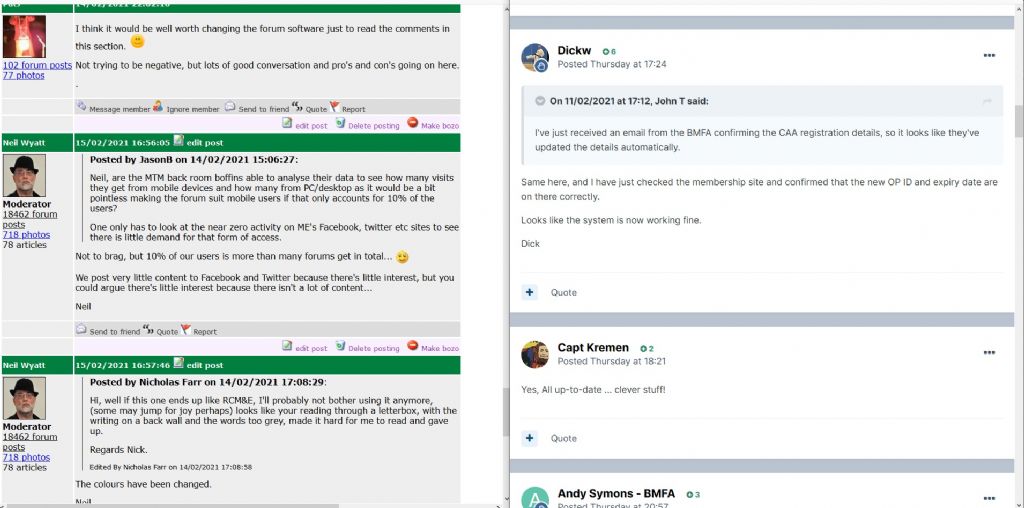
                I thought I would compare this website and Model flying one side by side. I normally view this one at 130% zoom, so this is both sites at 130%, side by side but to be honest I think I would only need 120% with the modelflying one.

                I can't say I find the new style at all hard to read, and I think the pastel coloured bars are a lot less intrusive than the green ones here.

                Bear in mind tht this image is reduced size…

                web compared.jpg

                #527537
                JasonB
                Moderator
                  @jasonb

                  It's not so much the pastle/green bars as the brighter background to the actual posts.

                  Add the fact there seem to be a couple of blank lines at the end of each post and that just makes the "white" are even greater.

                  If the actual post were the same light blue of the quoted text that would be a lot easier on the eye.

                  Neil do you also loose the right column when zoomed in or have you cropped both images

                  Edited By JasonB on 15/02/2021 17:09:03

                  #527547
                  ega
                  Participant
                    @ega
                    Posted by JasonB on 15/02/2021 17:08:49:

                    It's not so much the pastle/green bars as the brighter background to the actual posts.

                    Would a browser "theme" mitigate the problem?

                    #527548
                    Emgee
                    Participant
                      @emgee

                      Comparing the 2 pages shown is a bit like chalk and cheese IMO.

                      Emgee

                      #527576
                      Michael Gilligan
                      Participant
                        @michaelgilligan61133
                        Posted by Neil Wyatt on 15/02/2021 17:04:35:

                        I thought I would compare this website and Model flying one side by side. I normally view this one at 130% zoom, so this is both sites at 130%, side by side but to be honest I think I would only need 120% with the modelflying one.

                        I can't say I find the new style at all hard to read, and I think the pastel coloured bars are a lot less intrusive than the green ones here.

                        Bear in mind tht this image is reduced size…

                        web compared.jpg

                        .

                        Based on that comparison :

                        (a) The subtle grey background is much easier on the eye, and

                        (b) the ME/MEW site has a higher ‘signal to noise’ [content to wasted space] ratio, whilst remaining quite legible.

                        I doubt my opinion will be of any consequence though: I’ve been one of many complaining about the stupid ‘auto-smiley’ things for years … and they only needed to be switched off.

                        MichaelG.

                        #527606
                        Roger Best
                        Participant
                          @rogerbest89007

                          smiley Another vote for " beware what you asked for".

                          I am an enthusiastic member of The Unofficial Mamod and Other Steam Forum, it used to be huge, then the host organisation decided to change and the owner (a volunteer not a company) decided to take the opportunity to modernise and migrate to another host.

                          Result – huge number of threads where lost during the migration, promises (and contracts) broken. A large number of members dropped out, some because they didn't like the cosmetics, other offended that their careful work had been deleted, some to avoid the bitterness.

                          Fortunately the community has some robust individuals and has survived and regained some strength but the migration was at great cost, especially the cost of the huge loss of information.

                          This <CTRL>+<right click> is wonderful. party

                          #527607
                          Colin Heseltine
                          Participant
                            @colinheseltine48622

                            I've got to admit seeing them side by side I still prefer the current site layout. To my mind the two pages you have compared are not a very good comparison as the ME/MEW has lots of text and the flying one very little. My eyes prefer to see a distinct difference in text colour to the background (and preferably black text on white or pale background. I am yet another of the 40% of males who are colourblind. I remember many years ago going to a large meeting with over 150 people and we were being given a financial report. A lot of the graphs and figures were in smallish text and were red/green. I raised the point that many of us could not actually see/distinguish what was being shown.

                            I have to admit whilst we have such a good website (whether or not it migrates) I do not see the need or use of a Facebook Page or Twitter a/c.

                            Colin

                            Edited By Colin Heseltine on 15/02/2021 22:02:17

                            #527616
                            Peter Greene
                            Participant
                              @petergreene36336
                              Posted by Michael Gilligan on 15/02/2021 19:29:26:

                              Based on that comparison :

                              (a) The subtle grey background is much easier on the eye, and

                              (b) the ME/MEW site has a higher ‘signal to noise’ [content to wasted space] ratio, whilst remaining quite legible.

                              I doubt my opinion will be of any consequence though: I’ve been one of many complaining about the stupid ‘auto-smiley’ things for years … and they only needed to be switched off.

                              +1 (on all counts).

                              #527642
                              Nicholas Farr
                              Participant
                                @nicholasfarr14254

                                Hi, yes those big brilliant white "letterbox's" as I call them, overwhelm the writing and is a strain on my eyes and some only have a few words in them, which make them worse, in my opinion. I have no problem with the green bars and they separate each post distinctively, which makes (for myself, that is) easy to follow the flow of the thread. I've no problem with updating things, but I think the basic layout and style as it is, should stay pretty much the same. I agree with MichaelG about the background of the posts, on here and his "[content to wasted space] ratio".

                                Regards Nick.

                                P.S. I have no problem about the adds and other info on the right hand side, which are convenient at various times, but are ignored for most of the time.

                                Edited By Nicholas Farr on 16/02/2021 07:51:48

                                #527648
                                John McNamara
                                Participant
                                  @johnmcnamara74883

                                  Hi All

                                  If the current discussion was about the interface with the users, for example improving the methods used to upload images; Some platforms support "drag and drop", that would be a worthwhile improvement. Making the program easier to use is a worthwhile objective.

                                  However the current font size and the grey background is easy to read. Please don't muck about with it without very careful testing with users.

                                  This is a commercial website as well as a great (and free) forum. The advertisements are an important part of the websites continuing success, advertisements occupy the right hand side of the screen OK to me. On the left the poster name and stats, so far so good.

                                  What concerns me is as shown in some of the examples shown in this thread the width of the left or right columns can dominate the available space, squeezing the hard to read small and pale text of the actual posts into a small space.

                                  If there is going to be changes a clearly defined need for each change must be documented taking the end users point of view and the commercial imperative into account.

                                  So who will get the job to "Fix" the program ?
                                  Management will often pass the design to the web programmers. This can be a big mistake! Savvy computer users are not typical users, what appears simple to a power user can be quite daunting to a less experienced user. Testing and retesting with typical users is essential.

                                  Regards
                                  John

                                  Edited By John McNamara on 16/02/2021 08:28:33

                                  #527653
                                  Emgee
                                  Participant
                                    @emgee

                                    As John says above "However the current font size and the grey background is easy to read. Please don't muck about with it without very careful testing with users."

                                    I agree 100% with every point in the statement.

                                    Emgee

                                    #527659
                                    Nick James
                                    Participant
                                      @nickjames

                                      Please! No changes. It's fine as it is.

                                      #527664
                                      Circlip
                                      Participant
                                        @circlip

                                        And still no post numbers.

                                        Regards Ian.

                                        #527695
                                        Nick Clarke 3
                                        Participant
                                          @nickclarke3

                                          MichaelG's comment that this site is easier on the eye and John's about being easy to read quoted by Emmgee are not quite the same thing. Human vision depends upon contrast and so it is easier to distinguish items where there is high contrast – on a computer screen black on white or black on yellow are effective. However neither of these are particularly restful on the eyes as a high luminance (bright) colour scheme can be tiring to use.

                                          The answer is to maintain the contrast while lowering the brightness to an acceptable level. Unfortunately this is sometimes difficult to do as many LCD screens and laptops in particular control the brightness and contrast by adjusting the backlight rather than the image displayed, even though there may be controls labelled brightness and contrast.

                                          The current colour scheme attempts to address the issue of tiredness by reducing the brilliance of the background by changing its colour. This seems an effective and easy way forward until declining contrast sensitivity of the viewer becomes an issue due to age or visual conditions.

                                          If you find the brightness of a site with black print on a white background difficult reduce the brightness rather than changing the background colour to grey which simultaneously reduces the contrast. On modern push button LCD monitors this can be a confusing wander through a number of menus but may need to be done as all of the LCD monitors I have come across seem to be set at 50% brilliance and 50% contrast out of the box and this is rarely the optimum once contrast sensitivity begins to decline after the age of 20 or so depending upon eye health.

                                          Vision and text is a complicated compound of different, sometimes contradicting issues and usually one aims only for the best compromise. Two examples – a 'thin' or 'lightweight' font like the one this site uses is harder to see, but the counters or 'holes' in letters like O B and D are easier to distinguish and c & e are easier to tell apart. So Bold is more difficult, but then so is the lightweight normal! Also making print larger may make it easier to see but less is taken in at a single glance so reading, and making sense of what has been read can become slower.

                                          The most important single piece of advice must be to take breaks from the screen. While outside the workplace the Display Screen Regulations are not policed, it is important to remember that they still offer excellent advice if you are using computers for extended times in the home.

                                          Nick

                                          Lead Teacher of ICT to Blind and Visually Impaired Students

                                          Qualified Teacher of the Visually impaired

                                          #527707
                                          Frances IoM
                                          Participant
                                            @francesiom58905

                                            Until this thread I had never realised the site used a grey background – I overrode all site defined colours in favour of my own including text font – by using the brightness on the laptop display (a simple control in Linux) I have had comfortable viewing with my old eyes for years – as I’ve pointed out before the original HTML standard which assume full user selection was prostituted by commercial interests

                                            Edited By Frances IoM on 16/02/2021 11:46:37

                                            #527717
                                            JA
                                            Participant
                                              @ja

                                              I have been trying to follow this posting over the few months. It started as a suggestion that this website format was outdated and not fit for purpose. After a dormant period it was pointed out that a sister website had a new format which was work in progress and the first viewings were disappointing. The thread then seemed to have decended into chaos with a lot of contributors believing that this website will follow RCM&E's site. This believe has been helped by the apparent lack of denial that this will happen from any of those that run the forum.

                                              A simple question: Are there plans to redesign this website in the near future?

                                              JA

                                              #527759
                                              Peter Greene
                                              Participant
                                                @petergreene36336

                                                JA, you are in the same position I was a few days ago.

                                                Check out Neil's post on 11/11/2020 @ 10:53:32 ((Page 4 of this thread) when I think it will become clear.

                                                #527760
                                                Neil Wyatt
                                                Moderator
                                                  @neilwyatt

                                                  Interesting that people prefer the lower contrast black on grey to black on white, yet earlier others were complaining the previous iteration of the RCME site had too little contrast.

                                                  It seems these things are easily reconfigurable, I anticipate that we will try some initial settings and get feedback before making changes.

                                                  When this happens I hope people will appreciate it may take a few iterations to get the optimum result and bear in mind that what suits one may not suit all.

                                                  If we can find a scheme that everyone can live with and most like, that will be a good result.

                                                  Neil

                                                  #527766
                                                  Neil Wyatt
                                                  Moderator
                                                    @neilwyatt
                                                    Posted by JA on 16/02/2021 12:28:44:

                                                    I have been trying to follow this posting over the few months. It started as a suggestion that this website format was outdated and not fit for purpose. After a dormant period it was pointed out that a sister website had a new format which was work in progress and the first viewings were disappointing. The thread then seemed to have decended into chaos with a lot of contributors believing that this website will follow RCM&E's site. This believe has been helped by the apparent lack of denial that this will happen from any of those that run the forum.

                                                    A simple question: Are there plans to redesign this website in the near future?

                                                    JA

                                                    Yes, what was a long-wished for change demanded by many forum members is soon to be put into action.

                                                    Not unsurprisingly some others are worried about changes.

                                                    The truth is that this forum software is not sustainable. Just like the archive having to move from Flash to HTML5, it's inevitable that we have to move to a new platform just to keep things going. The patching up of the forum software is near the limit of what is possible.

                                                    The biggest changes will be to finding your way around, and this will take a little while to get used to.

                                                    Once you have become used to viewing a personalised 'content I have posted in' page with links to the latest unread posts I am sure all will like this feature.

                                                    Equally, a 'latest content' page that also lets you do the same for threads you are following but haven't commented on.

                                                    Someone mentioned 'still no comment numbers', well actually there will be, revealed by a 'share' button that allows you to copy a link direct to any comment.

                                                    Much improved quoting, including the facility to 'collect' several quotes from different people/threads and paste them into one comment.

                                                    Neil

                                                    #527770
                                                    Frances IoM
                                                    Participant
                                                      @francesiom58905

                                                      “When this happens I hope people will appreciate it may take a few iterations to get the optimum result and bear in mind that what suits one may not suit all.”
                                                      and that was entirely the reason that the original HTML allowed the individual user to alter the presentation format.

                                                    Viewing 25 posts - 251 through 275 (of 299 total)
                                                    • Please log in to reply to this topic. Registering is free and easy using the links on the menu at the top of this page.

                                                    Advert

                                                    Latest Replies

                                                    Viewing 25 topics - 1 through 25 (of 25 total)
                                                    Viewing 25 topics - 1 through 25 (of 25 total)

                                                    View full reply list.

                                                    Advert