New Look
New Look
- This topic has 197 replies, 51 voices, and was last updated 22 November 2013 at 17:09 by
 Sub Mandrel.


- Please log in to reply to this topic. Registering is free and easy using the links on the menu at the top of this page.
Latest Replies
-
- Topic
- Voices
- Last Post
-
-
Easiest/cheapest source of R8 socket
Started by:
Beardy Mike
in: Workshop Tools and Tooling
- 9
-
19 July 2025 at 00:07
Pete
-
Please direct me to where I can find an engineer to do some bespoke work
Started by:
srb1
in: Beginners questions
- 5
-
18 July 2025 at 23:57
srb1
-
How many spokes do I really need?
Started by:
Fulmen
in: Related Hobbies including Vehicle Restoration
- 8
-
18 July 2025 at 23:48
Wade Beatty
-
What Did You Do Today 2025
1
2
…
7
8
Started by:
JasonB
in: The Tea Room
- 33
-
18 July 2025 at 22:15
Nigel Graham 2
-
Model Engine running just off a naked flame
Started by:
Blue Heeler
in: Stationary engines
- 3
-
18 July 2025 at 22:06
David George 1
-
Herbert B drill information?
Started by:
Andrew Tinsley
in: Workshop Tools and Tooling
- 4
-
18 July 2025 at 20:23
Andrew Tinsley
-
Which lubricator do I need
Started by:
Michael Callaghan
in: Locomotives
- 3
-
18 July 2025 at 19:53
duncan webster 1
-
Even the Dealer Didn’t Know!
Started by:
Chris Crew
in: The Tea Room
- 14
-
18 July 2025 at 19:50
not done it yet
-
Backplate studs
Started by:
Dalboy
in: General Questions
- 5
-
18 July 2025 at 19:46
Dalboy
-
William Hazeldine … Proving Machine
Started by:
Michael Gilligan
in: Materials
- 5
-
18 July 2025 at 18:47
Michael Gilligan
-
Paint stripper does not do what it says on the tin
Started by:
Greensands
in: Hints And Tips for model engineers
- 3
-
18 July 2025 at 18:15
Greensands
-
Measuring a double Vee lathe bed Vee position
Started by:
Kim Garnett
in: General Questions
- 11
-
18 July 2025 at 15:26
Pete Rimmer
-
Advice to machine stationary engine base plate
Started by:
Greg H
in: General Questions
- 5
-
18 July 2025 at 13:26
JasonB
-
“swedish iron”
Started by:
moonman
in: Materials
- 16
-
18 July 2025 at 13:06
Martin Johnson 1
-
Electronic leadscrew pitching error
Started by:
paulg 1
in: Introduce Yourself – New members start here!
- 4
-
18 July 2025 at 10:32
JasonB
-
Soldering to gold plating
Started by:
Stephen Harris 5
in: General Questions
- 10
-
18 July 2025 at 08:53
Stephen Harris 5
-
Ti-6Al-4V
Started by:
Vic
in: The Tea Room
- 2
-
17 July 2025 at 20:59
old mart
-
Model Engineer Magazine Collection
Started by:
mfengine1
in: Books
- 8
-
17 July 2025 at 18:19
John MC
-
Multi Cylinder Radial Engine.
Started by:
ebeneezer
in: I/C Engines
- 5
-
17 July 2025 at 14:34
duncan webster 1
-
motor and switch wiring Myford ML7
Started by:
1957jmh
in: Workshop Tools and Tooling
- 7
-
17 July 2025 at 14:22
1957jmh
-
TurboCAD – Alibre File Transfers.
1
2
3
Started by:
Nigel Graham 2
in: CAD – Technical drawing & design
- 12
-
17 July 2025 at 12:21
Nigel Graham 2
-
Silver steel crankshaft
1
2
Started by:
teamricky
in: Stationary engines
- 11
-
17 July 2025 at 11:49
cogdobbler
-
Chucking Money Away!
Started by:
Chris Crew
in: The Tea Room
- 6
-
17 July 2025 at 11:33
Chris Crew
-
Drawings for constructing a Rolling Road
Started by:
Greensands
in: Help and Assistance! (Offered or Wanted)
- 8
-
16 July 2025 at 21:12
ChrisLH
-
Boiler Design – issue 4765
1
2
…
8
9
Started by:
Charles Lamont
in: Model Engineer & Workshop
- 27
-
16 July 2025 at 17:04
Paul Kemp
-
Easiest/cheapest source of R8 socket
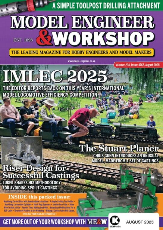
Latest Issue
Newsletter Sign-up
Latest Replies
- Easiest/cheapest source of R8 socket
- Please direct me to where I can find an engineer to do some bespoke work
- How many spokes do I really need?
- What Did You Do Today 2025
- Model Engine running just off a naked flame
- Herbert B drill information?
- Which lubricator do I need
- Even the Dealer Didn’t Know!
- Backplate studs
- William Hazeldine … Proving Machine

