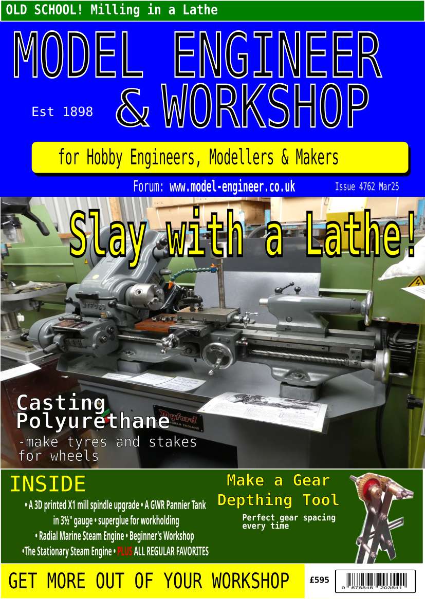
NEW LOOK – Model Engineer & Workshop
NEW LOOK – Model Engineer & Workshop
- This topic has 180 replies, 57 voices, and was last updated 27 March 2025 at 01:36 by
 Gerrit Visser.
- Please log in to reply to this topic. Registering is free and easy using the links on the menu at the top of this page.
Latest Replies
-
- Topic
- Voices
- Last Post
-
-
Twin Engineering’s heavy mill/drill quill removal
Started by:
Martin of Wick
in: Manual machine tools
- 6
-
30 June 2025 at 23:33
James Frankland
-
Bearing boxes for ball race
Started by:
Paul McDonough
in: Beginners questions
- 8
-
30 June 2025 at 22:43
Stuart Smith 5
-
All things Beaver Mill
1
2
…
8
9
Started by:
Robert James 3
in: Manual machine tools
- 42
-
30 June 2025 at 21:14
Mark Rand
-
IME Watchmakers lathe
Started by:
Greensands
in: Manual machine tools
- 4
-
30 June 2025 at 20:29
bernard towers
-
2 Machine lights
Started by:
modeng2000
in: Workshop Tools and Tooling
- 2
-
30 June 2025 at 20:15
modeng2000
-
New member looking for help
Started by:
manfromthemist
in: Introduce Yourself – New members start here!
- 9
-
30 June 2025 at 20:01
manfromthemist
-
Firth Valve Gear
Started by:
Andy Stopford
in: Traction engines
- 7
-
30 June 2025 at 19:58
Andy Stopford
-
Wiring up a single phase AC motor with 4 wires
Started by:
ell81
in: Beginners questions
- 6
-
30 June 2025 at 19:49
Howard Lewis
-
M type top slide conversion??
Started by:
jimmyjaffa
in: Beginners questions
- 4
-
30 June 2025 at 19:37
Howard Lewis
-
New (old!) member
Started by:
iansoady
in: Introduce Yourself – New members start here!
- 3
-
30 June 2025 at 19:30
Howard Lewis
-
Request for a Slot to be Milled in a Shaft
Started by:
James Alford
in: Help and Assistance! (Offered or Wanted)
- 7
-
30 June 2025 at 19:04
Craig Brown
-
Meddings MF4 Manual
Started by:
Richard Kirkman 1
in: Help and Assistance! (Offered or Wanted)
- 9
-
30 June 2025 at 16:11
Richard Kirkman 1
-
FreeCAD v1.0 tutorials
1
2
3
Started by:
Michael Gilligan
in: CAD – Technical drawing & design
- 12
-
30 June 2025 at 15:40
Speedy Builder5
-
Boiler Design – issue 4765
1
2
…
7
8
Started by:
Charles Lamont
in: Model Engineer & Workshop
- 26
-
30 June 2025 at 12:58
Paul Kemp
-
High strength 4mm steel?
1
2
Started by:
iansoady
in: Materials
- 20
-
30 June 2025 at 10:55
JohnF
-
What Did You Do Today 2025
1
2
…
6
7
Started by:
JasonB
in: The Tea Room
- 32
-
30 June 2025 at 07:37
Diogenes
-
cutting cams
Started by:
bricky
in: Help and Assistance! (Offered or Wanted)
- 4
-
30 June 2025 at 06:54
JasonB
-
Cookies
Started by:
Michael Gilligan
in: The Tea Room
- 4
-
29 June 2025 at 21:42
Fulmen
-
Multi Cylinder Radial Engine.
Started by:
ebeneezer
in: I/C Engines
- 3
-
29 June 2025 at 20:24
JasonB
-
Clarkson MK3 t&c grinder
Started by:
Gerd Vanhaevere
in: Manual machine tools
- 5
-
29 June 2025 at 19:07
noel shelley
-
Offen screw type telescopic gauge.
Started by:
Graeme Seed
in: Workshop Tools and Tooling
- 3
-
29 June 2025 at 18:41
bernard towers
-
Tell ‘Em Straight! (Anti-virus sellers)
Started by:
Nigel Graham 2
in: The Tea Room
- 3
-
29 June 2025 at 13:35
Andrew Crow
-
Sanjay’s Banjo Engine
Started by:
JasonB
in: Stationary engines
- 3
-
29 June 2025 at 10:05
JasonB
-
My experiences with an ELS lathe
Started by:
David Senior
in: CNC machines, Home builds, Conversions, ELS, automation, software, etc tools
- 9
-
29 June 2025 at 08:59
Diogenes
-
TurboCAD Snaps and Dimensioning?
1
2
Started by:
Nigel Graham 2
in: CAD – Technical drawing & design
- 8
-
28 June 2025 at 18:30
Nigel Graham 2
-
Twin Engineering’s heavy mill/drill quill removal