NEW LOOK – Model Engineer & Workshop

Advert

NEW LOOK – Model Engineer & Workshop

Home Forums Model Engineers’ Workshop. NEW LOOK – Model Engineer & Workshop

Viewing 25 posts - 1 through 25 (of 29 total)
  • Author
    Posts
  • #777893
    sohara
    Participant
      @sohara

      Introducing the New Look: Model Engineer & Workshop
      The Leading Magazine for Hobby Engineers and Model Makers

      We’re excited to share the New look Model Engineer & Workshop, a new and improved magazine combining the best of two icons: Model Engineer and Model Engineers’ Workshop.

      What is Model Engineer & Workshop?
      Model Engineer & Workshop reunites Model Engineer magazine, with over 125 years heritage of covering the creative mechanical hobby that shares its name and Model Engineers’ Workshop which covers all aspects of machining, tools and techniques.

      Editor’s Message…

      If your hobby includes any aspects of engineering, the ME&W will have much to interest you in its pages. Bigger than either of its predecessors it has the space to cover all aspects of model engineering from traditional live steam models to gas turbines, from clocks to toolmaking We look in depth at the skills you need to get the most out of your hobby: using maintaining and improving lathes, mills and other workshop machines such as 3D printers and CNC. We also cover the widest range of workshop activities – traditional ones like casting, brazing and welding to modern skills like using embedded electronics. Finally, we keep you up to date with what’s happening in the world of hobby engineering with our event reports, news features and reviews.

      Neil Wyatt

      Join the Community
      If your hobby involves engineering, Model Engineer & Workshop is your essential companion. Subscribe today and be part of a vibrant community dedicated to creativity and craftsmanship.

      👉 Subscribe now at: http://www.classicmagazines.co.uk/model-engineers-workshop

      Let us know what you think of the new look, and share your projects with us here in the forum—we’d love to see what you’re working on!

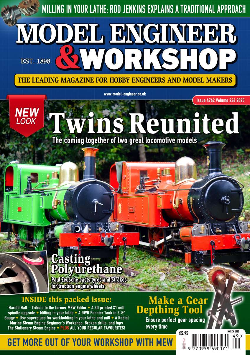
      MEW Mar-25 - issue 4762

      Advert
      #777898
      JasonB
      Moderator
        @jasonb

        Proof reader not working on the Editors message!

        The link takes you to MEW

        Last line on the cover should say Get more out of ME&W not MEW

        Yellow dot needed between marine engine & beginners

        #777906
        SillyOldDuffer
        Moderator
          @sillyoldduffer

          Not obvious to me.  Is it the missing bullet before “Beginner’s Workshop:”  or the abbreviation MEW rather than ME&W?   Does the mistake matter – I’ve never proof-read a magazines front cover, it’s the pretty pictures and contents list that get me going.

          To me, the “New Look” is still very traditional, but no harm in that – I like steam engines!   Pleased, because it shows Neil and Diane are building on strengths rather than starting a revolution!   Will steam attract makers into the hobby though? I doubt it.

          Wonder if we ought to run a front cover competition? As with all design work, far easier to spot mistakes made by others than it is to get it right oneself.

          Can’t wait to read Neil/Diane’s first editorial.   Will it be ‘strap in, everything is changing’, or ‘relax, you are in safe hands’, or ‘expect some mild turbulence whilst we find out what works’?

          Dave


          #777914
          sohara
          Participant
            @sohara

            Hi Jason

            Link should take you to MEW – the page will be updated once the final issue goes out – so dont worry about that. In terms of the cover, its not final and still being tweaked – just a first view to get some feedback of the look rather than a spell check. Hopefully that explains things for you. It would have been great to have had feedback on the cover – what do you think?

            #777917
            sohara
            Participant
              @sohara

              Thanks Dave – some great feedback there. We are excited about how this title will build.

              #777920
              Nigel Graham 2
              Participant
                @nigelgraham2

                Too cluttered I think. It’s for serious enthusiasts of a creative hobby, not a “celebrity” showpiece.

                I’d rather the “Workshop” be in the same font as “Model Engineer” to show equivalence. By being bigger and bolder it suggests some sort of superiority over its much more senior partner. It would also make the cover look a bit less cluttered.

                It actually reminds me of a certain East Dorset technical-college merger that used a similar trick in the publicity to put what it considered the minor partner in the shade, before expunging its name entirely and calling itself a “university”.

                #777931
                sohara
                Participant
                  @sohara

                  Appreciate your feedback.

                  #777941
                  JasonB
                  Moderator
                    @jasonb

                    Dave, it is both items. Two errors the missing yellow bullet and the fact we have been told the abreviation will be ME&W yet the bottom line says MEW.

                    Steve thank God it is not final as I would have hoped extra attention was given to this and the next few issues as they are what will make subscribers stay or go. From your opening post and the cover shot it looks like Cock up corner is still going strong.

                    I’ve given my views on cover and particlarly the format of the title elsewhere so won’t go into that again.


                    Content I will wait until the survey results are in as they are what should guide the mag going forwards but to me the locos on the front just say “New Look, same content” if you must have a loco then use a photo of one being worked on which will suit all parties.

                    Oh and on the cock up content the Radial Marine Engine series finished in the last issue, lets not have that repeated.

                    #777942
                    Nick Wheeler
                    Participant
                      @nickwheeler

                      It’s very fussy.

                      Why the two slogans Get more out & The leading magazine? Pick one and stick with it. It doesn’t need to be in it’s own block of colour either.

                      Milling in the lathe appears twice. Removing the top banner would help with the clutter.

                      Different fonts for the title is ugly. So are the dull colours. Why are there so many?

                      Only designers care about new looks. I doubt anyone else has ever bought a magazine just because of that.

                      Where else would the content be, but inside?

                      #777949
                      Baz
                      Participant
                        @baz89810

                        The leading magazine statement is incorrect, it is now the only magazine.

                        #777952
                        mgnbuk
                        Participant
                          @mgnbuk

                          If the purpose of the cover is to attract new readers by standing out on the news stand, then this is just “more of the same” that made the likes of WHS bury ME and MEW in amongst nostalgia steam and railway modelling magazines – only real change from Model Engineer appears to be adding “& Workshop” to the title.

                          I guess ME subscribers will be happy to see miniature locos featuring prominently & maybe re-assured that such content will still be a prominent feature. MEW subscribers maybe less inclined to continue, if the new combined title appears to be going more “model”.

                          Won’t make any difference to me – I “consume” the content via Readly.

                          Nigel B.

                          #777956
                          Bazyle
                          Participant
                            @bazyle
                            On Nick Wheeler Said:

                            Where else would the content be, but inside?

                            Like the adverts “1 in 8 men get prostate cancer in their lifetime” I’m really worried about getting it after I die.

                            Am I the only person who has stacks of old Mags and some in cardboard sleaves on the shelf that presents the spine at the open edge? Do all the newsagents I don’t visit carefully put their magazines in the racks with the spine covered by the next publication so that the issue number (and month???) is not covered?

                            PUT THE ISSUE NUMBER AT THE TOP LEFT and now that it will be monthly put the 3 letter month abbreviation and 2 year digits up there just below it. Will make it so easy to find a particular one.

                            #777959
                            sohara
                            Participant
                              @sohara

                              Not final as mentioned, we are 3 weeks from that – just getting the cover out there for some constructive feedback.

                              #777962
                              Nicholas Farr
                              Participant
                                @nicholasfarr14254

                                Hi, it looks a bit blingy to me, but that maybe because the photo is zoomed in too much, as some of the buffer beam is missing on the r/H side loco, and there’s little or no margin either side of both them, whether one likes locos or not, as has been said, it’s a bit too cluttered.

                                Regards Nick.

                                #777964
                                sohara
                                Participant
                                  @sohara

                                  Thanks Nick

                                  #777967
                                  Charles Lamont
                                  Participant
                                    @charleslamont71117
                                    On sohara Said:

                                    Not final as mentioned, we are 3 weeks from that – just getting the cover out there for some constructive feedback.

                                    I agree. Too busy, too ‘tabloid’. No class, no style. For a restrained, different, and classy hobby magazine cover, look at Furniture and Cabinetmaking. I’m reasonably OK with the title block on the blue ground though, apart from that silly ‘R’ which has already been well mocked.

                                    #777969
                                    Weary
                                    Participant
                                      @weary

                                      In addition to comments above:

                                      Far too cluttered.   The ‘content banner’ ‘Milling in your lathe’ at very top is easy to miss as one’s eye is attracted by the far-larger magazine title area immediately below.   The subject itself in this banner is not inspiring: it is by its’ own admission ‘traditional'(!!) and has been covered many times.  Might have been relevant to a wide range of ‘model engineers’ many years ago but far less-so nowadays.  Get rid of this banner to clean-up the front cover.  What are the two gears in the top-left corner there for??  Rod Jenkins didn’t ‘mill those in the lathe’!  Tho’ nota: If he did, then suddenly I am very interested in his article.  Article mentioned in the ‘Inside this packed Issue’ listing at bottom left of cover too; why is this article unique in getting mentioned twice on the cover?

                                      ‘The leading magazine … etc.’ banner (yellow background) immediately below title:  Will anyone buy the mag simply because of it being ‘the leading mag’??  Take banner at bottom of page ‘Get more out of your workshop… etc.’ and move up replacing the ‘The Leading Mag …. etc.’ with words to the effect:

                                      ‘Get more out of your model engineering & workshop’.  Or ‘Get the most … etc.’

                                      Far more positive a message.

                                      Lose the yellow banner at bottom of cover.

                                      The red tag hanging-down from title banner at left, reads ‘New Look’:   People will not buy the  mag simply because of a ‘new look’ (??).  Might attract a few ‘browsers’ to have a leaf through the magazine in WH Smith etc., so I can see that it may have a role to play; but how many are they? Suggest, if you must have ‘a message’ here then something like: ‘New Look, New approaches’.  Nota: only true if  you actually have some new aspirational articles to offer!  We don’t know the actual content of any of the articles listed on the cover.

                                      Main cover picture and subject chosen to focus on far too dull.  So! Two locos have been brought together: nice (I guess).  And I am a committed ‘loco-man’.  But what about something focussing on the supposed subject of the magazine as the lead i.e. (model engineering) construction and workshop processes.  At first glance the chosen main subject is hardly ‘aspirational’.

                                      ‘Inside this packed issue’ at bottom left beneath main pic’ looks like a listing of the articles in the order that they will appear in the mag’ (??) .   Too-many topics – list some of the ‘big attractions’ if  you must have something here, but you have already listed ‘Casting Polyurethane’ and ‘Make a Gear Depthing Tool’ elsewhere ‘dotted about’ on the cover with pics.  Why distract from those if they are your big attractions to readers?   With all the clutter is is actually easy to miss the ‘featured’ attractions.   I would suggest that  you loose this ‘Inside this packed issue’ altogether.  A couple of items that will attract customers on cover with pics far better.  If you do retain it then strongly suggest that you change the ‘heading’ to ‘Also Inside this Issue:’ and at the very least shift the Harold Hall ‘obituary’ to the end,  I would not list it at all on the cover – politely suggest this is an article unlikely to attract many readers and unlikely to contribute to the stated topics of the mag’.

                                      On a side-issue:

                                      Who is ‘sohara’??  What is their role in this??   What is their actual influence??  Presumably works for Mortons’, but unless I have missed it there is no explanation nor introduction anywhere.    Profile is blank.

                                      Phil


                                      #777970
                                      sohara
                                      Participant
                                        @sohara

                                        Thanks Phil – some interesting thoughts, appreciate it.

                                        I am the Publisher for the title.

                                        #777974
                                        JasonB
                                        Moderator
                                          @jasonb

                                          Regarding the band at the to about Rod’s gear cutting (on the lathe)

                                          The cover is mostly going to attract the casual buyer in Smiths etc and the way mags are stacked you are only likely to see that and the title, possibly some of the main photo if you are lucky.

                                          So that is what needs to make someone pick it up and then they can read what else is inside from what is listed lower down or as most of us do ignore that and just thumb through the pages.

                                          #777977
                                          Nicholas Farr
                                          Participant
                                            @nicholasfarr14254

                                            Hi, I can’t se anything wrong with the Banner and the title area myself, they are much the same size as both ME & MEW have been for a long time, and I don’t see how anyone can really miss the Banner, unless their eyesight is poor, (maybe need to go to that well known TV ad slogan place) I may not like the Banner and title area, but I don’t dislike it either, after-all, it’s only identifying what the magazine is.

                                            Regards Nick.

                                            #777978
                                            JasonB
                                            Moderator
                                              @jasonb

                                              Harold Hall ‘obituary’ to the end,  I would not list it at all on the cover – politely suggest this is an article unlikely to attract many readers and unlikely to contribute to the stated topics of the mag’.

                                              Though I did see mention of his passing as an excuse to reprint one of his old articles from the archive. Suppose it costs nothing. Might be better to show a few items of his as part of the obituary and suggest a digital sub will give you access to them all.

                                              #777986
                                              bernard towers
                                              Participant
                                                @bernardtowers37738

                                                Who the hell is Sohara?

                                                #777987
                                                JasonB
                                                Moderator
                                                  @jasonb

                                                  He answered that question earlier

                                                  #777988
                                                  JasonB
                                                  Moderator
                                                    @jasonb

                                                    steve

                                                    #777992
                                                    Nick Wheeler
                                                    Participant
                                                      @nickwheeler
                                                      On Nicholas Farr Said:

                                                      Hi, it looks a bit blingy to me,

                                                      Compared to the racks of mags in Smiths this afternoon it looks old-fashioned and boring.

                                                      Compared to MEW from twenty years ago, it looks old-fashioned, amateurish and boring.

                                                    Viewing 25 posts - 1 through 25 (of 29 total)
                                                    • Please log in to reply to this topic. Registering is free and easy using the links on the menu at the top of this page.

                                                    Advert

                                                    Latest Replies

                                                    Viewing 25 topics - 1 through 25 (of 25 total)
                                                    Viewing 25 topics - 1 through 25 (of 25 total)

                                                    View full reply list.

                                                    Advert

                                                    Newsletter Sign-up