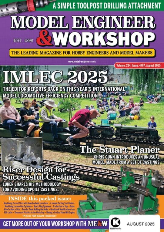
NEW LOOK COVER FOR MEW

Advert

NEW LOOK COVER FOR MEW

Home Forums Model Engineers’ Workshop. NEW LOOK COVER FOR MEW

Viewing 10 posts - 76 through 85 (of 85 total)
  • Author
    Posts
  • #604953
    JasonB
    Moderator
      @jasonb

      If that's the case then stick the competition at the top rather than a chainsaw adjuster that most won't have a need for.

      Advert
      #604963
      Neil Wyatt
      Moderator
        @neilwyatt
        Posted by JasonB on 08/07/2022 12:09:23:

        Posted by Neil Wyatt on 08/07/2022 11:16:50:

        Posted by Vic on 07/07/2022 19:44:08:

        Get rid of the chainsaw rubbish at the top would be my suggestion.

        Serious question – why?

        Edited By JasonB on 08/07/2022 12:08:32

        Sorry edited your post rather than quoted but this is my reply as to why

        Because it would be better placed below the title, which would still have it in the visible part of the page . Keep the title at the top and one liners below.

        Look at issues before 151 and just move the date below Workshop then the title can sit even higher

        Edited By JasonB on 08/07/2022 12:15:59

        That doesn't explain why it would be better.

        Neil

        #604964
        Neil Wyatt
        Moderator
          @neilwyatt

          It's interesting, because the changes were all specifically asked for on the grounds they encourage more sales.

          What's needed to ensure the future of the magazine is to attract new readers in a way that doesn't alienate existing ones.

          Are regular readers deeply concerned about things other than can they identify the magazine quickly, will it slip off the piles and can I find the issue number easily?

          Are the graphic layout changes just minor niggles or genuinely upsetting?

          Neil

          #604965
          duncan webster 1
          Participant
            @duncanwebster1

            Took me a while to work out what I was looking at. A shaper in a scrap yard?

            #604966
            Ches Green UK
            Participant
              @chesgreenuk

              An example of an 'engineering' magazine cover that is attractive, carries a clear message and entices one inside….. **LINK**

              Ches

              #604974
              lee webster
              Participant
                @leewebster72680

                Perhaps I am easy to please,but I can't see anything wrong with the cover as shown. I buy a magazine not by what it looks like, but by what it contains. A few months back I bought a copy of MEW because it had a mention on the cover of electroplating 3D prints.

                Lee

                #604975
                Peter G. Shaw
                Participant
                  @peterg-shaw75338

                  Neil,

                  Your post, two entries above poses a somewhat different question to your original post which referred specifically to Issue 318.

                  As it happens, I don't really care what the front cover looks like, just as long as I can easily see the Issue No. Similarly, I don't usually bother with the Contents pages, except on the very rare occasion when I'm looking for something and my home database has let me down.

                  Perhaps I should explain. I have a database into which I make entries of any article which might, just might, interest me. This database contains both Issue No. and Date so either would do when searching. In addition, I scan into the computer any article which has more relevance for me, eg currently I'm attempting to make an endmill sharpening jig, and this system of complete entries had three entries all on this subject. I was thus able to read all three entries without having to search through all my back issues. These complete articles are referenced by Issue No, not date, hence my emphasis on Issue No.

                  What would attract new readers? I haven't a clue.

                  I wish you well in your quest.

                  Peter G. Shaw

                  #604976
                  SillyOldDuffer
                  Moderator
                    @sillyoldduffer

                    I suggest the existing cover meets a number of different requirements, which tricky because it has more than one audience.

                    Many of the responses here reflect the needs of existing users, which I feel is dangerous. For example. I care about the Number, Title, and a bullet list of what's inside. I don't care about stuff I already know. To me the price, forum URL, and being told the magazine is aimed at hobby engineers, makers and modellers is irrelevant! I don't care about the background picture or eye catching bling. A plain cover would suit me.

                    Front covers shouldn't put much effort into pleasing existing subscribers. We're already on board and covers are unlikely to influence us. It's what's inside that matters.

                    Newcomers are a far better target for the message sent by a cover. Sadly, as I grow older, I realise that I won't be a Model Engineer forever. Therefore, it's necessary for the hobby to attract fresh blood, and ME and MEW are a good way of luring them in. To attract new friends covers must:

                    • Catch attention, so that people will do more than glance at them in a shop full of competing covers
                    • Hold attention and draw the person in by quickly imparting what the magazine is about and the level it's aimed at.
                    • Present a fun image, so that folk feel this is the sort of club they would like to join
                    • Address current technology as well as traditional methods

                    Just as it may be necessary to sacrifice a favourite child so that the others benefit, I think existing members have to accept what's on the cover isn't really for us! Covers should probably emphasise beginner rather than advanced subjects, and new developments and hot topics rather than old. Let's get more Makers involved – they're closely related to Modellers. Just as I've developed an interest in 3D design and printing, so they're likely to realise the value of lathes and milling machines.

                    I suggest the hobby is now more likely to attract members via Arduinos and Quadcopters than Engineering Apprenticeships, and the cover should appeal more to them. Once they read the rest of the mags, I can guarantee they'll also love live steam and our other favourites! I'm already struck by the tremendous range of interest and talent exhibited by Model Engineers. If it's remotely technical someone is deep into it.

                    Be interesting to know the demographic of new model engineers. My impression is a good proportion only get seriously stuck in at retirement because only then do we have time, space and sufficient money to support a moderately expensive hobby. This might be why the current magazine covers often feature portly grey haired or balding grandad types – just the type we want more of! As there's a hefty gap due to the age range obliged to concentrate on families and jobs, we have a hobby with an age chasm: youngster makers and oldster MEs. A tricky sales problem!

                    Those responsible for previous covers over the years deserve a medal: composing good ones must be hard work!

                    Dave

                    Edited By SillyOldDuffer on 08/07/2022 16:07:56

                    #604981
                    Howard Lewis
                    Participant
                      @howardlewis46836

                      It is of little use preaching to the converted, (Those who subscribe or have a standing order for the magazine ).

                      The object of the cover must be to attract attention and new readers, to become, hopefully new entrants, or returners,, to the hobby.

                      Publishers have objectives which do not necessarily coincide exactly with engineers. But if the the readers do not like what they see and read, the magazine will not sell in quantity. And we can guess what will happen shortly afterwards!y.

                      An attractive cover may provoke an impulse buy, that results in a new reader / subscriber and hobbyist.

                      As such, what the existing customers want needs have to slightly to secondary to what sells the magazine.

                      Of course, if you upset the existing clientele, they won't stay, so being too radical can backfire and defeat the purpose of the changes.. (Which means that those complaining are among the latter group )

                      As a subscriber, I would prefer to see a fairly straightforward, reasonably uncluttered cover showing a picture /s of something related to the contents, plus a few items that are featured inside.

                      The Issue number, barcode and price HAVE to be there for administrative / marketing reasons.

                      The cover for 318 does not really appeal to me, but as a subscriber, I am a fish already on the hook.

                      But even subscriptions have to be renewed

                      If it isn't too badly broken, do not overdo the fixing!

                      Howard

                      #605009
                      Anonymous

                        mew.jpg

                      Viewing 10 posts - 76 through 85 (of 85 total)
                      • Please log in to reply to this topic. Registering is free and easy using the links on the menu at the top of this page.

                      Advert

                      Latest Replies

                      Viewing 25 topics - 1 through 25 (of 25 total)
                      Viewing 25 topics - 1 through 25 (of 25 total)

                      View full reply list.

                      Advert

                      Newsletter Sign-up