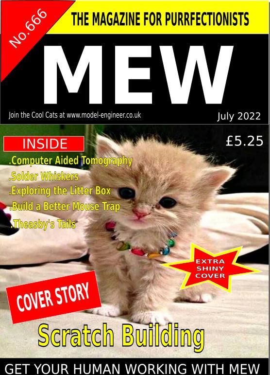
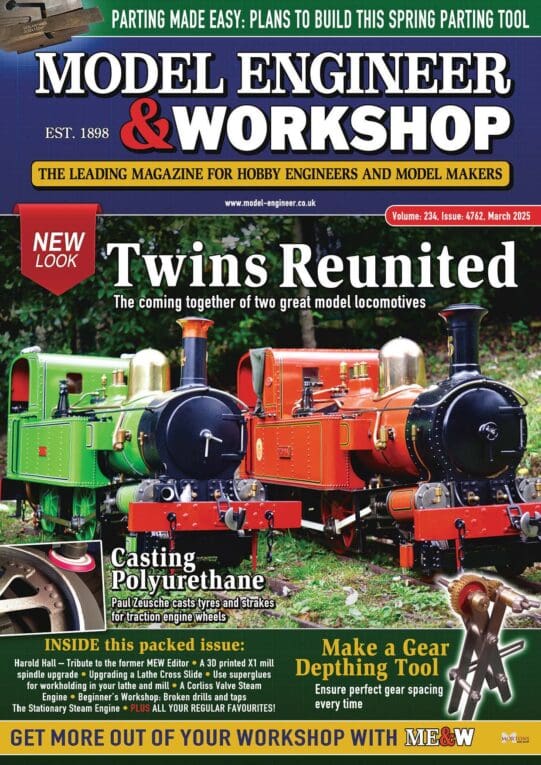
The "bleeding" of one colour into another, seems to have a feature of MEW for some time. I rather like it. What I do not like is the header above the magazine title.
Also, if the objective is to attract print buyers, the announcement of content needs to be prominent, akiun to a menu inviting a purchase.
I am not suggesting just a list of contents (That appears inside )
To me the previous way of showing some of the more appealing articles worked best.
Be a little wary of showing young ladies on the cover, no matter hoe flesh they show. A previous editor got a roasting for showing his daughter, as I recall, decorate with tinsel for a Christmas edition.
"Disgusted of Tunbridge Wells" did not approve, but personally, it made little difference to me.
The cover needs to tantalise the prospective reader with what is inside. The magazine will be bought for what bis inside, concerning what can be, is is being done, in workshops,.rather than some flash illustration.
Remember, "If it ain't broke; don't fix it", or not radically!, too rapidly.,
Howard
Anonymous.


![20220707_131135[1].jpg 20220707_131135[1].jpg](/wp-content/uploads/sites/4/images/member_albums/44290/911062.jpg)


