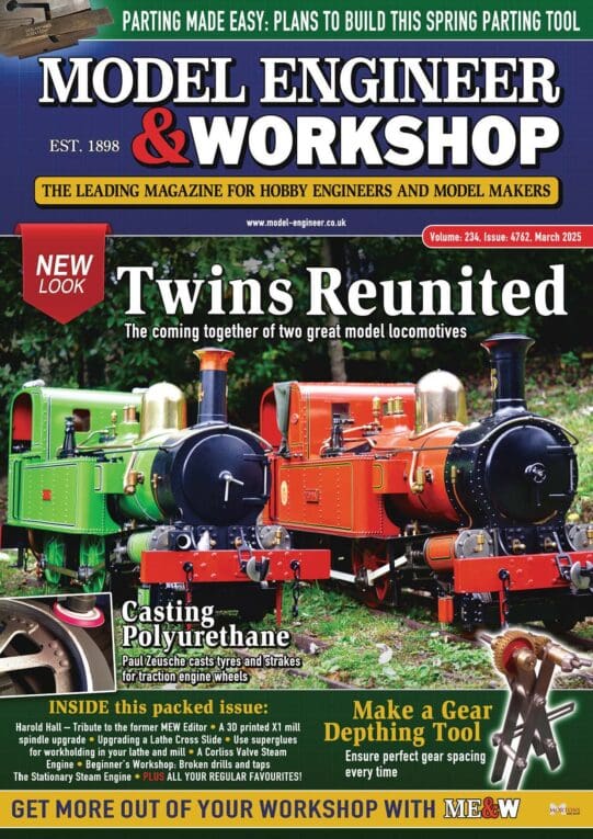
NEW LOOK COVER FOR MEW

Advert

NEW LOOK COVER FOR MEW

Home Forums Model Engineers’ Workshop. NEW LOOK COVER FOR MEW

Viewing 25 posts - 26 through 50 (of 85 total)
  • Author
    Posts
  • #604595
    Neil Wyatt
    Moderator
      @neilwyatt

      Mortons asked me to seek feedback… they are getting it! keep it up.

      317.. the 'young lady' on the lady is my partner, and I'm sure she will be delighted to be described as such

      My main reaction is… the old MEWs had pictures of people in their workshops, but in the days when resources covered someone going out regularly to photograph them. Hence, a competition in the hopes that readers will be enthused to get a friend to help out and take some really good photos, for covers or inside pages.

      Neil

      Advert
      #604597
      SillyOldDuffer
      Moderator
        @sillyoldduffer

        Forum members aren't the right people to ask about covers because:

        • we only care about content. We're already hooked and don't need to be reeled in by a fancy lure! The cover was important to me only once. It was when an issue of MEW caught my eye in a shop and I bought it, the rest is history. The words 'Engineering' and 'Workshop' were important, as was the picture of a machine. Now I mostly ignore the cover apart from the contents bullet list, which I would prefer to stand out boldly rather than be squashed into the footer. But it doesn't matter much: I read the whole magazine anyway.
        • many of us are retired gentlefolk for whom all new things are bad. I don't care what it is, change upsets me!

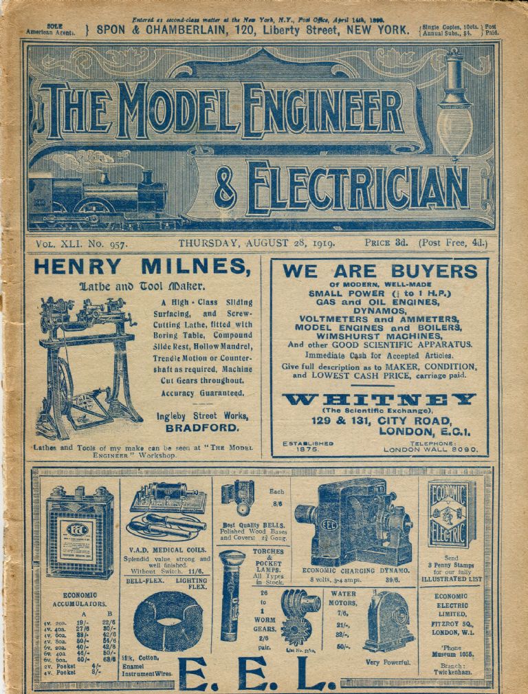
        To my mind, covers have been going downhill for years. In the good old days we had advertisements on the front, which is perfection:

        me1919.jpg

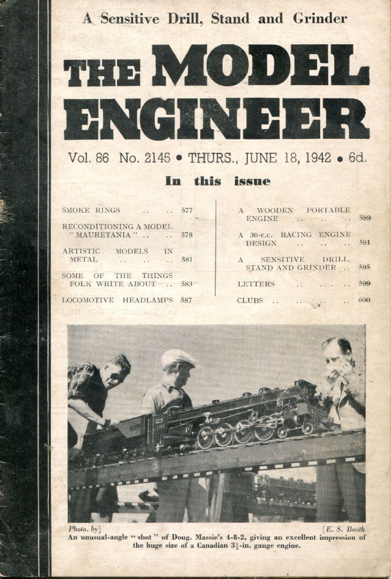
        In contrast Model Engineer had become disgracefully avant-garde by1942, and cost twice as much. Some young whipper-snapper changed the font and the layout. The content is thin too – the single reader letter, not LETTERS as it claims on the front, is about avoiding explosions in the workshop. I don't think it's wartime black humour.

        me1942.jpg

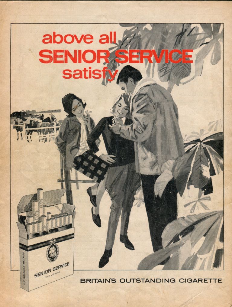
        Backsides are important too. This is from 1964:

        mebackcover.jpg

        After sneaking into the Pony Club an ageing romeo in a Sheepskin Jacket* is pictured introducing a couple of schoolgirls to their first cancer sticks.

        devil

        Dave

        * Only cads, bounders and Lotharios wear Sheepskin Jackets.

        #604598
        Nick Clarke 3
        Participant
          @nickclarke3
          Posted by SillyOldDuffer on 06/07/2022 17:02:29:

          After sneaking into the Pony Club an ageing romeo in a Sheepskin Jacket* is pictured introducing a couple of schoolgirls to their first cancer sticks.

          devil

          Dave

          * Only cads, bounders and Lotharios wear Sheepskin Jackets.

          And sheep of course!

          #604624
          Hopper
          Participant
            @hopper

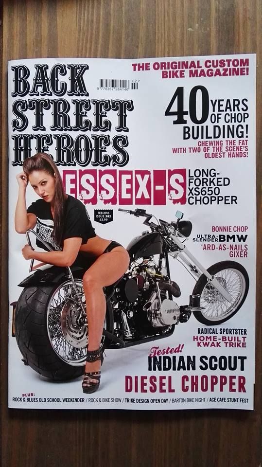
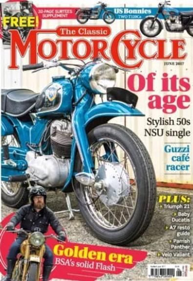
            If you are going to put people pics on the front, maybe follow the lead of some of Mortons' bike magazines?

            back-street-heroes-trike-design.jpg


            Or, more conservatively, run the plain machinery pic big — after all that is what we are interested in, right? — and the pic of the roughnut machinery enthusiast person smaller downpage: Gets the human element on there but keeps the main focus on the machinery.

            the-classic-motorcycle-uk-dec-2018.jpg


            Edited By Hopper on 06/07/2022 18:39:34

            Edited By Hopper on 06/07/2022 18:43:49

            #604628
            Nicholas Farr
            Participant
              @nicholasfarr14254

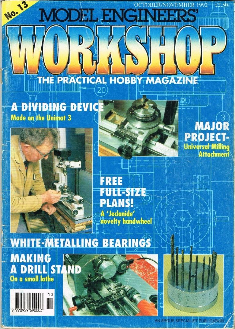
              Hi, after buying a couple of volumes of Model Engineer from a car boot sale, I thought to look in W. H. Smiths to see if the Model Engineer was still on sale and of course it was, however that's when MEW No.13 caught my eye.

              mew#13.jpg

              Now I've got no qualms about the No.13 in fact I quite like it, but that was the one that started me to keep buying it and had it and ME saved in W. H. Smiths until I took out a subscription for them both, I then got a few of the previous issues at one of the exhibitions and the rest off ebay.

              Regards Nick.

              #604633
              Ady1
              Participant
                @ady1

                I know which one I prefer

                #604634
                Andy Stopford
                Participant
                  @andystopford50521

                  I think issue 13's cover is far superior to the latest effort – simple, uncluttered, and giving a clear suggestion of what is likely to be inside.

                  Looking through the archive (good work getting that working again by the way), I'd also pick out the covers from 1997 to about 2008 as being pretty good, despite some rather lurid colour combinations for the text; subsequently there seems to have been an increase in labels (I don't know the technical term for these angled sticker-effect items) which give a messy effect.

                  And yes, lose the photos of old gits on the cover. If I want to know what they look like, I have only to look in the mirror…

                  #604639
                  Oldiron
                  Participant
                    @oldiron

                    I would go for a layout similar to Issue No 13. Clean, clear & no clutter. Issue # & date at the top so easy to locate in a pile.The nicely sized "The Practical Hobby Magazine" banner shows who it is aimed at. No need for lots of little panels containing tiny script.

                    Keep up the good work.

                    regards

                    #604658
                    Peter G. Shaw
                    Participant
                      @peterg-shaw75338

                      Now that someone's taken the trouble to reproduce Issue 13 cover, I agree, it is much nicer to look at. Although, I think the date could have been a bit darker as it doesn't really stand out. Anyway, I'm not going to look through 317 issues looking for the best looking…

                      As regards "young ladies", Neil, I sincerely hope I haven't upset your partner. It's just a phrase to use when you don't actually know their age.

                      Cheers,

                      Peter G. Shaw

                      #604678
                      John McNamara
                      Participant
                        @johnmcnamara74883

                        HMMM I think it is about time that we recognised that the workshop of today is likely to be quite different to the workshops we started in the post WW2 period. More and more engineering enthusiasts are moving towards CNC, Laser cutting, and other tech, now reasonably affordable. And this new cohort of engineers is able to take on paying work! Yes many do.
                        For manual metalworkers, as we have seen lately the prices of vintage machines Myford, South Bend, Colchester and many others have gone through the roof. And yes like it or not "import" machines can and often do represent better value. Again a change in the makeup of a workshop.
                        Manual versus CNC? that is a matter of personal choice the cost is fairly similar if you shop carefully.

                        To me a rethink on the way the magazine presents itself is in order.

                        Jason B got it right by emphasising WORKSHOP, I would take it further deleting model and hobby references altogether!

                        7-07-2022 8-22-20 am.jpg
                        We want to attract the next generation, The existing subscribers already know what the magazine is about.

                        Regards
                        John

                        #604681
                        Hopper
                        Participant
                          @hopper

                          Trouble is the next generation are second-generation digital natives and not great magazine readers. They are more likely to go online to find out about their hobby. They refer to magazines and newspapers as "heritage media" and think it's quaint their grandad still reads them but can't quite understand why.

                          Edited By Hopper on 07/07/2022 00:42:54

                          #604695
                          DMB
                          Participant
                            @dmb

                            BUT I haven't got a long forked chopper!

                            #604697
                            DMB
                            Participant
                              @dmb

                              Neil,

                              I like the top of MEW, where "Model Engineers" seems to be about the right size and "Workshop" is also a good size – LARGE letters with that wonderful multi-hue colouring to the letters make it stand out and memorable, immediately indicating the content subject matter.

                              Well done so far, just keep it up!

                              John

                              #604699
                              DMB
                              Participant
                                @dmb

                                Bearing in mind majority of readers probably baldies and Grey's or even snow white's with possibly deteriorating eyes, do away with that awful small font contents list which only repeats the inner contents list.

                                Get rid of that horrible slippery surface finish. When that recently re-appeared after a fuss made about that somewhile back, I thought, oh no, here we go again. Mags won't stack. Snow white and long in the tooth, what few are left!, I may be but always willing to consider anything new to decide if it's any good/what use to me? Change for the better always welcome.

                                #604700
                                Jon Lawes
                                Participant
                                  @jonlawes51698

                                  If it is sat next to a copy of Model Engineer I think I would want to know exactly what to expect from each magazine. My normal interest in these magazines is "what is in here that I could make at home?" so my personal preference would be a picture of whatever is the project of the week. A picture of a person doesn't engage me (not matter how visually appealing) because that person could be on the cover of a magazine on Knitting, Model Railways, PC Maintenance, it doesn't tell me anything.

                                  So for me a nice big picture of the project and clear writing showing what the magazine contains would be my preference, and anything else just clouds the impact.

                                  #604702
                                  DMB
                                  Participant
                                    @dmb

                                    Agree with Jon Lawes' comments in that the most interesting item inside should be selected with a reasonably bold title for the cover.

                                    Wenches on wheels are ideal for a bikers mag.

                                    #604707
                                    DMB
                                    Participant
                                      @dmb

                                      I like "heritage media" (Hopper), when it comes to mags – subscriptions for MEW, ME, EIM, Narrow Gauge World and Computer Active. Read very few newspapers these days, just an assortment of various paper's content put on Google.

                                      Note my subscription to MEW/ME/NGW, they are all completely different subjects.I regard EIM as being a mix like ME used to be. Clever marketing to split subject matter of ME as it was. CA is another story and it helps keep me up to speed with what's going on in computer related sphere.

                                      Edited By DMB on 07/07/2022 08:18:18

                                      #604709
                                      Hopper
                                      Participant
                                        @hopper
                                        Posted by DMB on 07/07/2022 08:12:46:

                                        I like "heritage media" (Hopper), when it comes to mags – subscriptions for MEW, ME, EIM, Narrow Gauge World and Computer Active. Read very few newspapers these days, just an assortment of various paper's content put on Google.

                                        But are you one of the next generation? Or are you one of the gentlemen of a certain age like most of the rest of us?

                                        #604712
                                        DMB
                                        Participant
                                          @dmb

                                          Hopper, look at my post 07.44, I forgot to mention that I'm one of the "snow whites", still costing precious Dosh for regular Barber visits. Had an old codgers bus pass for more years than I care to remember!

                                          Edited By DMB on 07/07/2022 08:25:57

                                          #604713
                                          Ady1
                                          Participant
                                            @ady1

                                            It was experimenting with making fishing bits that got me into this game

                                            I think new people can come from almost anywhere, any hobby where making stuff matters

                                            #604714
                                            Hopper
                                            Participant
                                              @hopper
                                              Posted by DMB on 07/07/2022 08:25:02:

                                              Hopper, look at my post 07.44, I forgot to mention that I'm one of the "snow whites", still costing precious Dosh for regular Barber visits. Had an old codgers bus pass for more years than I care to remember!

                                              Edited By DMB on 07/07/2022 08:25:57

                                              Yep. So our generation loves it's special interest magazines for sure. But not so for the "next generation" of young "makers" grown up in the digital environment. My son probably has not read a book or magazine since he left school. And his kids probably don't know what a magazine is, but can tell you chapter and verse of anything to do with computers and the net.

                                              #604718
                                              DMB
                                              Participant
                                                @dmb

                                                Neil,

                                                To summarise,

                                                1. Get rid of the awful slippery surface

                                                2. Keep the multi – coloured large bold "Workshop" title as that's what the mag is about.

                                                3. Simplify the cover with one large pic of what you think is the most interesting item inside.

                                                4. Get rid of small font contents list, which is better inside in it's current layout.

                                                5. Have a decent sized issue no. at the top as in the past with the date next to it. Most of us horde back numbers as a reference source and need issue no. or date to find required reference.

                                                #604729
                                                DMB
                                                Participant
                                                  @dmb

                                                  Hopper,

                                                  Years ago my late wife's work colleague who had a young son at that time who said, "Mum, what's an EP?"

                                                  And any other reader young enough to not know, it's Extended Play, referring to a 7" diameter vinyl record, doing 45RPM in a record player, all the rage back in the 50s/60s. Many famous names on them, e.g., The Beatles.

                                                  John

                                                  #604736
                                                  DMB
                                                  Participant
                                                    @dmb

                                                    I have most volumes of Model Engineer and note all the changes in design, colour or lack of it, size, content etc. Notably, before 2nd WW, large format brown (and I think, some blue colouring) with full page inside photo of a large lathe with the operator sitting on board the saddle. Sort of like those damn great bending rolls (for ships armour plating) just inside the gates of Chatham dockyard. Subject photo changed of course, with each weekly issue. The war years saw their offices burnt out but ME kept going in entirely black and white in miniature format and weekly.

                                                    After the war it gradually had a splash of front cover colour on a bigger format and around 1963 a giant format for a short while and propper colour printing, still weekly for sometime. Now down to fortnightly and a smaller size that appears to be a mag industry standard.

                                                    Wonder for how long before we're forced to accept digital only?

                                                    Edited By DMB on 07/07/2022 09:46:51

                                                    #604752
                                                    Peter G. Shaw
                                                    Participant
                                                      @peterg-shaw75338

                                                      DMB,

                                                      Wonder for how long before we're forced to accept digital only?

                                                      Don't give them ideas!

                                                      Peter G. Shaw

                                                    Viewing 25 posts - 26 through 50 (of 85 total)
                                                    • Please log in to reply to this topic. Registering is free and easy using the links on the menu at the top of this page.

                                                    Advert

                                                    Latest Replies

                                                    Viewing 25 topics - 1 through 25 (of 25 total)
                                                    Viewing 25 topics - 1 through 25 (of 25 total)

                                                    View full reply list.

                                                    Advert

                                                    Newsletter Sign-up