Anyone using Firefox may like to try an add on called Dark Reader, gives a night screen, dark background with white lettering, only trouble is it will be active on all of your sites.
Worth browsing around for other available Firefox add-ons in this respect (Tools > Settings > Extensions and Themes > Search). Many (most?) can be turned on and off from the toolbar for individual sites.
I imagine similar add-ons are available for other browsers too.
Now I normally browse the forum without logging in as I rarely post. On the the old one if you were on a thread you wanted to post in there was a log in option on that page which once logged in kept you on that page. Not so here
It actually worked this way on the old site many moons ago (DC’s time I think). It was changed – so that you could duck out, log in and be returned to your original position – by popular request. One of the small changes which had unanimous approval iirc.
Hang in there. It’s a logical setup and should come along in time (I should think).
Mention was made of not seeing any improvements over the old forum yet I wonder how much people have looked? I’m still not at all happy with it but people have been asking for years for some of these things that have now been added.
Big problem is, I suspect, is that no one particularly articulated what was great about the previous forum software, like “Latest posts” because people don’t complain about what works well but what they would like. The old system ran on Microsoft IIS of some sort so I can understand the change.
However now that key features are no longer there… people are quick to complain. Hopefully there is a path to fixing the biggest gripes.
I do not doubt there are things that some people wanted, but to me this site is definitely not easier. Being rather forgetful these days I used to refer to “my posts” to reach a recent topic that I had posted. It was easy, but not so now.
You can “sort of” get that functionality by clicking <Profile> on the lower green bar of the banner at top of page. Not as clear as on the old site (nor as obvious as “My Posts”) but ….
Mention was made of not seeing any improvements over the old forum yet I wonder how much people have looked? I’m still not at all happy with it but people have been asking for years for some of these things that have now been added
Big problem is, I suspect, is that no one particularly articulated what was great about the previous forum software, like “Latest posts” because people don’t complain about what works well but what they would like.
I can assure you that the active Moderators during testing have all been extremely articulate in the need to have “latest posts” or something similar for the last couple of months as well as all the other things we know a workable forum needs like a screen that is easy to read.
I give my time freely which has probably been a good thing as I’m not afraid to say it like it is whereas those employed as freelancesr, staff or on a retainer may not want to step out of line too much
Is it just me? I was playing around with CTRL-SCROLLWHEEL to enlarge/reduce the text size and it seemed that when I enlarged it much, the banner took up an even greater percentage of the screen than normal (for me).
Frankly, I think the banner/”useful area” ratio is overweighted anyway but poor-eyesight people may be worse off.
Mention was made of not seeing any improvements over the old forum yet I wonder how much people have looked? I’m still not at all happy with it but people have been asking for years for some of these things that have now been added
Big problem is, I suspect, is that no one particularly articulated what was great about the previous forum software, like “Latest posts” because people don’t complain about what works well but what they would like.
I can assure you that the active Moderators during testing have all been extremely articulate in the need to have “latest posts” or something similar for the last couple of months as well as all the other things we know a workable forum needs like a screen that is easy to read.
I give my time freely which has probably been a good thing as I’m not afraid to say it like it is whereas those employed as freelancesr, staff or on a retainer may not want to step out of line too much
I do appreciate that Jason, and we are all very grateful for the moderation teams efforts. I as referring to the design stage more than anything else.
I had not realised that you had sight of the new software pre release. Perhaps we should have a whip round and buy the developer/design team some hearing aids?
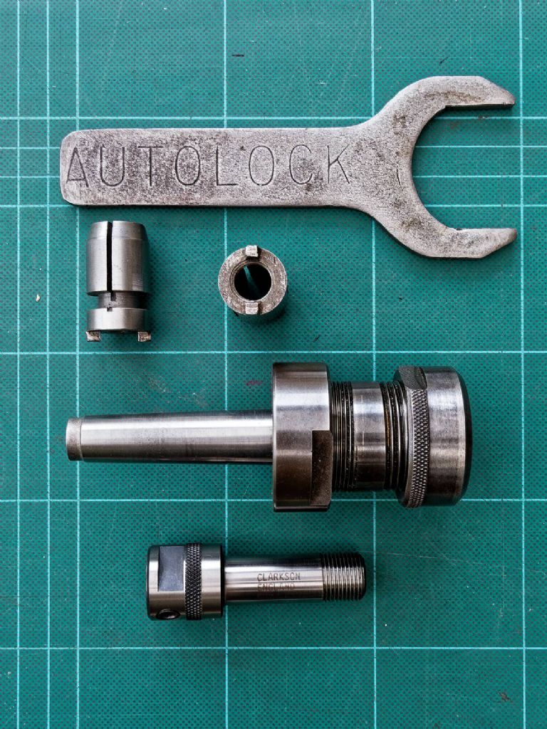
I’m still trying to search for the post on Autolock; aware that it’s now hard to find on the forum, I thought I’d try on archive.org, so see if I could at least find it manually. It didn’t find it, as that particular address hasn’t been archived, but many other posts are on their server.
5) In my previous reply, Gray’s quoted post is more prominent then my reply; on most forums, it’s less prominent, or at least in the same size of text.
As an aside, I’ve just moved some text around within this reply, with Control X & V; the internal formatting such as emboldening the 5) was lost.
6) Related to “Lego” searching in my previous post.
I’ve now entered “Autolock” into the box adjacent to the blue search icon/radio button at the head of the Forums page (next to the Latest Activity button).
Unlike from the Lego search box, there’s now loads of hits for Autolock, both from the old forum entries, and also my previous post on the new forum.
This search does seem to work OK.
6a) With a general search on a common word, such as Autolock, there are a huge number of hits, but the resulting output shows all of the content of each post, which makes for a lot of work isolating the required one (or more).
Many forums have an Advanced Search option, where the user can select to search all text, just thread titles, user names, etc,
6b) Sometimes Advanced Search is only available to registered users, which gives a good incentive to join.
7) Have I missed it, or is there no option to add a user signature, which auto inserts at the end of each post?
8) More for information to others, than an issue itself.
Log on to your own profile, I know you still can’t view it, but I think that’s reported elsewhere
Activity Tab; seems to show activity on the new forum Profile Tab; no current access, though you can modify it under Settings Tab. Forums Tab, several options including a useful search box. Topics Started and Replies Created seem to be the way to find your old posts.
e.g. I found that I’ve not started a topic on Autolock, but entering “Collet” in the search box, takes me to a post linking to my old album of 20 or so photos, intended to help others identify what chucks they have.
Unless albums are later transferred, it looks like this will always point to a dead end, which is a shame as several other posts refer to it.
Entering “Autolock” into Replies Created, gives me a list of all my mentions of the word, on both old an new forums, which is good. 8b) I wonder if Google will fully re-index the new forum, such that the links which end up with a Lego box, will eventually drop down the rankings and be replaced with valid ones?
9) Out of curiosity, , and just using this one post as an example, as it’s nice and simple, with no replies.
I copied the image URL and used it as a Google Image Search; No Image at That URL etc.
The same is true if I copy the image, and try “Find Image Source“.
The link is actually valid and brings up a photo if pasted into a browser address bar.
As it stands at the moment, when I read this post, still under reply mode, the URL I posted above this line shows as a photo icon, even though I right clicked and insert as plain text.
I do appreciate that Jason, and we are all very grateful for the moderation teams efforts. I as referring to the design stage more than anything else.
I had not realised that you had sight of the new software pre release. Perhaps we should have a whip round and buy the developer/design team some hearing aids?
I’m not sure if there was one, quite short if there was.
large boot may be money better spent
Presumably for you and SillyOldDuffer Dave? If so, steel toecaps? Sizes?
I should have said how much I appreciate the efforts of everyone who’s put so much hard work and, in many cases, private time into getting this far.
11) An observation, Just gone back to edit my second to last post to add a correction and found that I’m no longer able to edit it.
Is this because of a timeout, similar to the old forum, or is it because I’ve had part of that post quoted?
If the latter, I’d say that’s a good thing as it maintains continuity, and potentially helps to avoid arguments and poor etiquette.
Just another observation; spellcheck works well as it picked up my typo in “ettiquette” and a simple right click allowed me to select the correct spelling. Is that my browser, or the forum, as previously a right click caused issues in the old forum?
12) For information of other users, re. my original point 2a, back on a previous post Underline is available, just not selectable from an icon. N.B. please see point 12b below; it looks like strike-though works though Tee hee
Either toggle, or select text, and Control u for Underline, Control b for Bold, and Control i for Italics; they may be Combined. 12a) This is obviously easy on a Windows keyboard, but might it be an idea to add the Underline icon to the top bar make it easier for mobile users?
12B) Please disregard my previous point 12 re underlining.
Control U does underline the text in the post when you type it, but it seems to be lost when you submit the post.
13) Is there any plan to make a “Preview Post” button available to check your input, before hitting submit?
14) I’ve not tried this yet, as I don’t want to loose too much typing; on some forums I use, if you start entering a post, reply, or edit, and accidentally hit the browser’s back button, you lose all your work; on others, if you then page forward again, the previous input is stored on the forum, and you’re asked if you’d like to keep it for further editing.
Is this operative here, and if not can it be implemented?
15) On the old forum, to save losing work, it was possible to submit a partial post, and then edit it several times, maybe to add more content, or change formatting; there wasn’t a preview button there either as I recall.
It was then possible to delete the list of edited comments below the final entry/signature; the last edit was always recorded for good reason.
I’ve edited this post three times now, once to add this final point, so I assume it will show 3 edit entries at the bottom. I only re-opened it to delete the previous two edit remarks, to tidy it up to just the one.
16) Referring back to my initial post on this thread, Page 9; 678933, issue 1)
I mentioned the problem about failing to be able to insert a screenshot in a quoted post from Gray.
It seems I was doing it correctly as I’ve just inserted that relevant screenshot into a post on the test thread
16a) Growl mutter mutter, it seem the above URL, chosen from the actual post number of the line, when converted to a hyperlink, takes you to the top of the thread, rather than to the post itself, so the viewer has to scroll all the way down to the relevant post.
N.B. I’ve just re-opened this post in order to take a screenshot of the image upload failure, but even failed with that, as the screenshot has uploaded this time.
No idea what’s going on here, but I don’t think I’m doing anything wrong.
… a quick scroll down those results includes posts by you about els
MichaelG.
MichaelG and Nick
Yes, I’ve done search by name with success. However, with this post I had moved on to more general search. Maybe familiarity will help, or an “advanced” search facility will be implemented to make life easier? I’m old and prefer to avoid change, especially when new is worse. Thanks to mods for all the work you have put in to get it this far though.
Just a general comment, you will see me put something like “admin to deal with” in some of my replies, this is to help them pick up on the many questions that Me and SOD can’t answer or mostly bugs and wants that need adding to their list as we can’t and won’t keep up with listing all of them.
I’m using Firefox and I’m finding the new forum to be very slow. A particularly annoying problem is that when returning to the forum list after viewing a post I get a full screen showing…
Document Expired
This document is no longer available.
The requested document is not available in Firefox’s cache.
As a security precaution, Firefox does not automatically re-request sensitive documents. Click Try Again to re-request the document from the web site.
I then click Try Again and Firefox has to reload the page accompanied with another long wait.
Yes, I’ve done search by name with success. However, with this post I had moved on to more general search. Maybe familiarity will help, or an “advanced” search facility will be implemented to make life easier? I’m old and prefer to avoid change, especially when new is worse. Thanks to mods for all the work you have put in to get it this far though.
Roy
.
I shall be astonished, Roy, if anyone sees fit to implement an “advanced” search facility hereabouts.
Shortly before we lost the old forum, I commended a modestly priced ‘engine’ which demonstrably works on many other sites … but I was pretty-much ridiculed for so doing.
Last night whilst investigating a member’s issue, I found various previously OK moderator functions were also malfunctioning. No idea why, but last night the site was unstable, a technical term for bugs or configuration errors that cause software to behave unpredictably.
Roughly 80% working OK last night, but several functions were misbehaving, and might still be.
Moderators are ordinary members with a few extra privileges that allow us to manage other members. We can edit posts, correct mistakes, check email addresses, block naughty members, and offer advice. At the moment, spending a great deal of time explaining changes and confirming bugs.
Moderators have no control over features, look and feel, privileges, or advertising etc; these are all the remit of the webmaster and his management.
In turn, the webmaster relies on developers and third-parties to provide software, hosting, network, security and other support functions. They are probably managed by an IT department. A site with over 43,000 accounts is much more demanding than a club forum, where a few dozen members can be supported by a basic set-up, even if it’s configuration is grossly inefficient.
This being a weekend, we may have to wait for the webmaster and developers to fix whatever went amiss next week.
In the meantime please be patient.
In my view some naive early decisions eventually forced Mortons into launching the forum with a large number of untested fixes, some of which were still broken. Then had to tackle performance problems – what happens when 2 part-time testers are replaced by tens of active members and the site is mobbed by internet bots!
Now Mortons are grappling with a seriously difficult challenge, which is diagnosing and repairing a big, complex live site in flight. Fixes are tested by applying them to a dynamic live environment, and it hurts users when they go wrong, perhaps by breaking something else. All too easy for a clutch of slightly wonky features to make fundamentally good software look bad.
Keep calm and carry on. We’ll get there in the end.