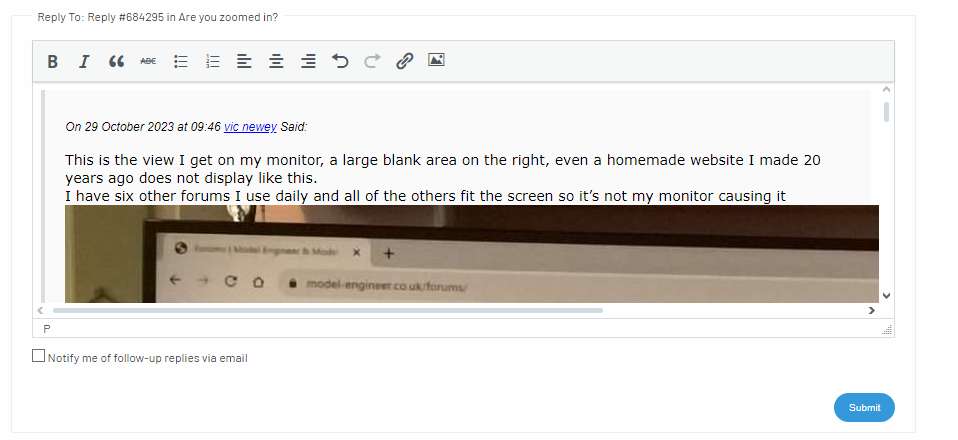
Are you zoomed in?

Advert

Are you zoomed in?

Viewing 24 posts - 1 through 24 (of 24 total)
  • Author
    Posts
  • #684262
    JasonB
    Moderator
      @jasonb

      Just a heads up about the appearance of the site, There was a post on MECH forum where th emember was getting the top half of the screen filled with the blue bar and could not even see a whole advert in classifieds.

      I managed to work out that he had the site zoomed in on his browser probably to about 160% and this is what his screen looked like.

      I wonder if there are any more out there with similar issues that would put them off using the site? At least that is one problem solved, just 999+ to go

      Advert
      #684266
      Nicholas Farr
      Participant
        @nicholasfarr14254

        Hi Jason, have just checked mine, and I have been zoomed in. My setting was not changed from when it was used on the old forum, which was a comfortable setting for me for all web sites. I have zoomed out a bit, but much of the texted looks a little small, and seems to make the white background more prominent. I may well have to put up with being over zoomed in.

        It now makes other websites I use, having wider left and right margins.

        Regards Nick.

        #684267
        JasonB
        Moderator
          @jasonb

          It would not be quite so bad if whoever the inturn was that did the layout had not made the thick blue band wider than the rest of the content below.

          Had it been the same width we could all see the font a bit larger, there would be no white strip down the left and the right would be about 2/3rds of what it is now

          You just can’t get the staff.

          #684270
          Michael Gilligan
          Participant
            @michaelgilligan61133

            The iPad defaults to displaying the whole as-designed [Sic] page layout.

            Mercifully, “pinch zoom” can push the distracting content out of view.

            MichaelG.

            #684272
            Nicholas Farr
            Participant
              @nicholasfarr14254

              Yes, that blue bar seems to go on forever on both sides if you keep zooming out.

              Regards Nick.

              #684273
              Nicholas Farr
              Participant
                @nicholasfarr14254

                Hi the only other thing I can’t understand, is why every other post has a glaring white background, which I find annoying.

                Regards Nick.

                #684274
                Nicholas Farr
                Participant
                  @nicholasfarr14254

                  Hi, the old forum may well have been in danger of collapsing, but this one still has much to be desired, and more than the old one did in my view, and in my above post, now that I’ve zoomed out a bit. it looks as if the letter F in the word find is snagging on the letter G in the word thing.

                  Regards Nick.

                  #684277
                  JasonB
                  Moderator
                    @jasonb

                    Took me a moment to work out what was happening Nick as I could not see the problem viewing at 100% (full size) until I zoomed to 80% and made the width smaller causing the text to wrap more onto the second line.

                    100


                    80

                    #684290
                    vic newey
                    Participant
                      @vicnewey60017

                      I zoom in and out of websites all the time using Ctrl and mouse wheel so this does not affect me, what does however is the site displaying this thread with a 1/3 of the page on the right hand side totally blank below the “Buy Latest/Back Issues”

                      This shows the layout is not correct and cannot autofit to different screen sizes. The magazine advert at the top right/hand of the page has messed up the entire layout, you just don’t see this kind of thing on a widely used professional website.


                      I tried adding a photo of my monitors view of this page but it would not show the full photo’s width even when I reduced the photo file right down.


                      #684292
                      Michael Gilligan
                      Participant
                        @michaelgilligan61133
                        On Nicholas Farr Said:

                        Hi the only other thing I can’t understand, is why every other post has a glaring white background, which I find annoying.

                        Regards Nick.

                        I think it’s an homage to the ancient days of sprocket-fed print-outs … when alternate lines were on white or green backgrounds.

                        What they have really done is put every other post on a very pale grey background [it was previously all in glaring white].

                        MichaelG.

                        .

                        Ref. __  https://www.reddit.com/r/nostalgia/comments/onmr29/green_and_white_computer_paper/?rdt=54918

                        #684295
                        vic newey
                        Participant
                          @vicnewey60017

                          This is the view I get on my monitor, a large blank area on the right, even a homemade website I made 20 years ago does not display like this.

                          I have six other forums I use daily and all of the others fit the screen so it’s not my monitor causing it

                          screen

                          #684297
                          Michael Gilligan
                          Participant
                            @michaelgilligan61133
                            On vic newey Said:

                            This is the view I get on my monitor, a large blank area on the right …

                            That’s to make room for all the forthcoming adverts, Vic !!

                            As you know; there are a few at the top of that column

                            … let’s not forget the raison d’être

                            MichaelG.

                            #684315
                            JasonB
                            Moderator
                              @jasonb

                              Original intention was to have Latest activity down the right side, early screen shot that includes the even more useless “popular topics”

                              activity numbers


                              And below that it was meant to give an indication of who is online by showing their avatar. Not really a function I see much point in and it’s failed to work since going live.

                              who 1

                              You can also blame Ketan for some of the white space as he pulled his advert due to it no longer being placed in the prime position he was paying a premium for.

                              #684385
                              SillyOldDuffer
                              Moderator
                                @sillyoldduffer

                                Worth mentioning again that the forum’s look and feel isn’t as intended yet.

                                Excessive white space is partly design, partly technical, and partly because stuff has been switched off pending investigation.  See Jason’s post above to see what was supposed to be in the right pane.  (Actually not quite what was asked for, with improvements in the wishlist.)

                                Trouble is, when members return to the forum and start exploring, they find a lot of oddities.  Don’t jump to the conclusion that the forum is intended to an installation art experience: it’s supposed to better than the old forum.  Far from it so far!  But think bugs and a grossly overloaded developer rather than whizz-kids insisting on a demented design.

                                Zooming in is surprisingly helpful.   The forum looks much better on my 14″ laptop than full size on my giant CAD screen.    Shouldn’t be necessary but at the moment it;s worth adjusting the browser window size and/or zoom,

                                Dave


                                #684399
                                peak4
                                Participant
                                  @peak4
                                  On vic newey Said:

                                  This is the view I get on my monitor, a large blank area on the right, even a homemade website I made 20 years ago does not display like this.

                                  I have six other forums I use daily and all of the others fit the screen so it’s not my monitor causing it

                                  screen

                                  That’s interesting, this is the view I get, with a much wider bar down the left hand side.
                                  Using Pale Moon this time as a browser, though the display is the same.


                                  image_2023-10-29_114556010

                                  Also interesting is if I take a screenshot of this reply pane, before submitting my reply.
                                  Your inserted image of your screnshot shows it before re-sizing to fit pane width.
                                  I’ve a feeling it is actually partially re-sized down to 1200 pixels, though the forum width is 800

                                  image_2023-10-29_115029298

                                  Bill

                                  #684400
                                  vic newey
                                  Participant
                                    @vicnewey60017
                                    On Michael Gilligan Said:
                                    On vic newey Said:

                                    This is the view I get on my monitor, a large blank area on the right …

                                    That’s to make room for all the forthcoming adverts, Vic !!

                                    As you know; there are a few at the top of that column

                                    … let’s not forget the raison d’être

                                    MichaelG.

                                    I’ll pass that French to Del boy to add to his collection of well known German phrases ( wot! no smilies on this forum)

                                    I realise they need to advertise the magazine as it supports the forum but the magazine adverts should be greatly reduced in size, after all they are active links to full sized images. Then the remainder of the page should expand sideways to fill the gap and the site wouldn’t look so disorientated and home made (perhaps it is?)


                                    #684405
                                    Michael Gilligan
                                    Participant
                                      @michaelgilligan61133

                                      Vic,

                                      I think my point might be better expressed as “they need the forum, to provide a target-audience for the advertising”

                                      MichaelG.

                                      #684418
                                      vic newey
                                      Participant
                                        @vicnewey60017
                                        On Michael Gilligan Said:

                                        Vic,

                                        I think my point might be better expressed as “they need the forum, to provide a target-audience for the advertising”

                                        MichaelG.

                                        In that case the forum definitely needs more priority then rather than a hindrance to advertising

                                        #684425
                                        Michael Gilligan
                                        Participant
                                          @michaelgilligan61133

                                          Exactly so, Vic

                                          … but “they” don’t yet seem to have realised what damage they are currently doing to that channel.

                                          MichaelG.

                                          #684529
                                          Nicholas Farr
                                          Participant
                                            @nicholasfarr14254

                                            Hi, OK when I click onto this site, the default setting looks as below on my Pavilion 17″ laptop.

                                            Screenshot (1a)

                                            When on Classifieds and I zoom out with one click on my wheel, I get this.

                                            Screenshot (2a)

                                            Then when I zoom out with two clicks on my wheel, I get this

                                            Screenshot (3a)

                                            However, when I click on this site on my Acer 11-1/2″ notebook, it’s default screen on classifieds is as the one immediately above, and when both are the same as immediately above, the post that I said the F looks like it’s snagging onto the G, looks as below.

                                            Screenshot (4a)

                                            Screenshot (4b)

                                            Regards Nick.

                                            #684747
                                            Michael Gilligan
                                            Participant
                                              @michaelgilligan61133
                                              #685122
                                              Neil Wyatt
                                              Moderator
                                                @neilwyatt

                                                I’m finding 130% is a good balance of readability and layout for me, but it does depend on the aspect ratio of your screen and personal preference (and which pair of glasses I have on – I’ve mislaid my ‘computer glasses’ that would let me use a lower zoom!) so there’s no right answer!

                                                Neil

                                                #685365
                                                Ian P
                                                Participant
                                                  @ianp
                                                  On JasonB Said:

                                                  Just a heads up about the appearance of the site, There was a post on MECH forum where th emember was getting the top half of the screen filled with the blue bar and could not even see a whole advert in classifieds.

                                                  I managed to work out that he had the site zoomed in on his browser probably to about 160% and this is what his screen looked like.

                                                  I wonder if there are any more out there with similar issues that would put them off using the site? At least that is one problem solved, just 999+ to go


                                                  I think the straight answer to your question is that there are a lot of people put off from using the forum.

                                                  It’s not too hard to say how many (because its a countable number if one wanted to trawl through postings) but the number will reduce as ‘put off’ becomes ‘drop off’ and the number of forum users will reduce, as will the number of advertisers.

                                                  Morton’s seem to have a death wish regarding the forum, or at the very least have little interest in it thriving. I assume its because the income it produces from advertising is marginal compared with the cost of running it so I see the forum side of Morton’s business being extremely low priority, run on a shoestring by minimal staff and relying on volunteers. I know nothing about publishing and don’t see that it is essential for a paper magazine to have an online presence or a forum, but the magazines Morton’s acquired already had those so I suppose they felt duty bound to continue with them.

                                                  Ian P

                                                  #685410
                                                  Ian P
                                                  Participant
                                                    @ianp
                                                    On SillyOldDuffer Said:

                                                    Worth mentioning again that the forum’s look and feel isn’t as intended yet. (my emboldening, Ian P)


                                                    Excessive white space is partly design, partly technical, and partly because stuff has been switched off pending investigation.  See Jason’s post above to see what was supposed to be in the right pane.  (Actually not quite what was asked for, with improvements in the wishlist.)

                                                    Trouble is, when members return to the forum and start exploring, they find a lot of oddities.  Don’t jump to the conclusion that the forum is intended to an installation art experience: it’s supposed to better than the old forum.  Far from it so far!  But think bugs and a grossly overloaded developer rather than whizz-kids insisting on a demented design.

                                                    Zooming in is surprisingly helpful.   The forum looks much better on my 14″ laptop than full size on my giant CAD screen.    Shouldn’t be necessary but at the moment it;s worth adjusting the browser window size and/or zoom,

                                                    Dave


                                                    Dave

                                                    ‘As intended’ infers that there was actually a planned format of how the new website/forum would appear and perform.

                                                    As an interested ‘participant’, I see what we have now giving the impression of it not being given any serious pre-planning or design.

                                                    Ian P

                                                  Viewing 24 posts - 1 through 24 (of 24 total)
                                                  • Please log in to reply to this topic. Registering is free and easy using the links on the menu at the top of this page.

                                                  Advert

                                                  Latest Replies

                                                  Viewing 25 topics - 1 through 25 (of 25 total)
                                                  Viewing 25 topics - 1 through 25 (of 25 total)

                                                  View full reply list.

                                                  Advert