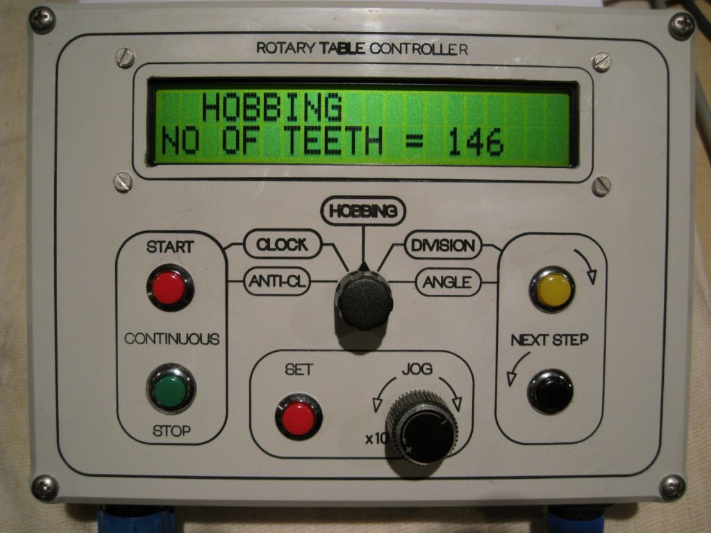
Bazyle makes an important point about user interfaces – they have to suit the user! Unfortunately, in addition to liking the controls, users also worry about cost, and, if its a project, how difficult it is to build. Designing good interfaces is difficult – lots of compromises and judgements.
The Liming's solution is a straightforward Arduino build. Cheap, well supported and plenty of modules. Gary's interface is a plug in display module with a 16×2 LCD and 5 push-buttons. This means his software has to deliver everything needed to control a rotary table with just 5 buttons. It's done with a system of nested menus, where pressing buttons navigates a tree of options until the required setting is found. The problem with this type of interface is it's not very intuitive, it's hard to remember, changing settings takes a relatively long time, and, by accidentally pressing the wrong button it's possible to get lost in the menu.
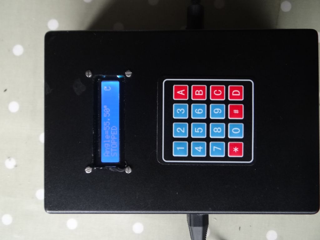
As John Stevenson mentioned he didn't like nested menus, I developed a rotary controller using a 4×4 keypad and a separate 16×2 LCD only module. The 4×4 keypad provides 16 buttons. Now the user can type in numbers 45.55°, and the keypad is conveniently labelled 'A' for Angle etc. The '*' button is go/stop. Most of the nesting is eliminated, the controls are easier to learn and remember, and it's possible to add more functionality, for example my version can be paused if the phone rings, there's a rewind function in case the most recent command moved the table wrongly, and the ability to type numbers allows the user to change to any table ratio, typically 1:40, 1:60, or 1:90. There's no need to label anything, though a laminated reminder list on the back might be handy. Slightly more difficult to build, about the same price as Gary's version, but the user still has to be slightly computer minded!
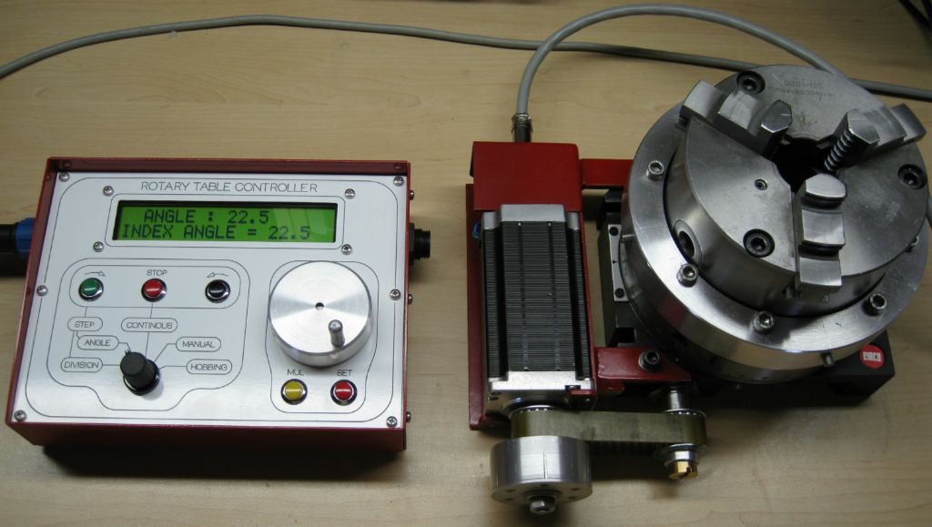
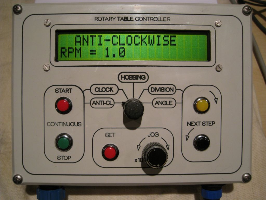
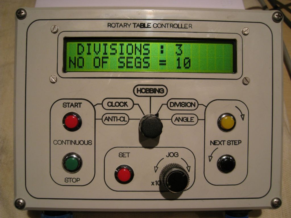
Joe's controller is the next step. He fixes the nested menu problem with 5 nice push-buttons, a five way switch, a potentiometer and a logical well-labelled front panel. The build cost is relatively high because of the number of components used, plus there's a need for some chassis banging to make the front-panel. Nothing beyond the skills of the chaps reading this forum.
All three approaches work, but I think most people would find Joe's version most intuitive. It's the most difficult and expensive to build, plus a moderate extra software hurdle to jump to get the Nucleo# working. Mine isn't as easy to use as Joe's, but – being simpler – it's cheaper and more straightforward to build. Gary's is easiest to build but the control interface is clunky. Some people can't get on with nested menus at all – they're just too annoying!
My dad came from a world where levers and buttons only did one simple thing and then you talked to a real person. He thought the computer menus I developed in the 1970s were insane. He had a point…
Dave
# Joe got me into Nucleo. It's similar to the Arduino but considerably faster, much more memory, and extra pins. It can be programmed from the Arduino IDE by installing optional software, but not all the Arduino libraries work. (Most do.)
Another issue is it's 3.3V logic, not 5V, and the interface is electrically more delicate – easier to damage if the wiring is cocked up. Nothing insurmountable, but a bit more to learn and understand. I tend to use Arduino Nano's for rough simple work, and the Nucleo for anything remotely demanding. The Arduino family has some high-end Nucleo-like processors, like the M0-Pro, but I've found the Nucleo easier to exploit, more powerful and it's cheaper.
Edited By SillyOldDuffer on 02/06/2020 10:00:48
An Other.


