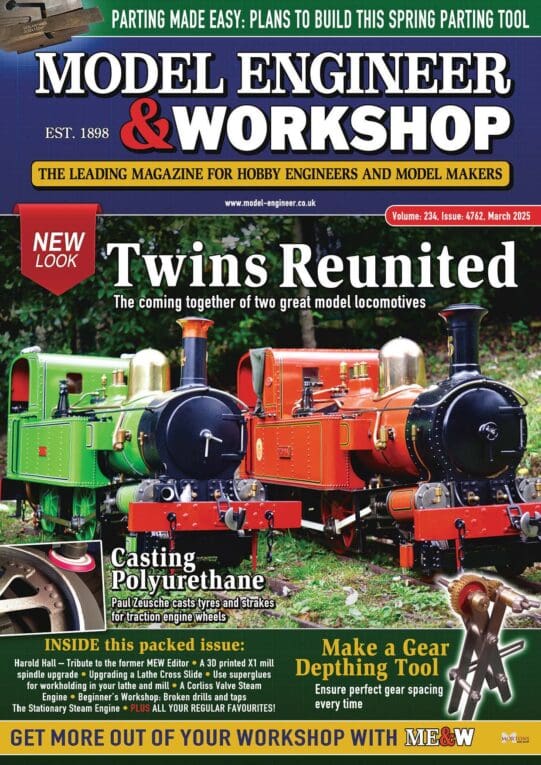
As a reader of MEW since issue No1, I must congratulate the editorial and design team of MEW for ruining a perfectly good magazine layout. It wasn't broke, so why did you try to fix it ?
I have the same comment about the missing Issue Number banner on the front cover, as others have already made – please put it back.
Contents page back to page 3 please. It's then easy to find that article in the issue one vaguely remembers by flicking straight to page 3 in each of the last few issues. OK, when the hard-copy index is published, or the on-line versions are updated, one should be able to go straight to the relevant issue – but not if you can't remember the article title. Surprisingly, seeing the contents page often jogs the memory.
BTW. Why have a page and a half of content ? More than half the additional space is just a repeat of "In our next issue" on page 41 and a lportion of the main contents page is an advertisement for "Subscribe today", repeating the information on page 35. Go back to the old, one page version please.
"The cover has been brightened up so it is easier for reader to find it on the newsagent's shelf" – Oh yeah ! Who are you trying to kid ? Compare it with issue 208. Apart from a change of colour in the words "Model Engineers'" and the loss of the words "The practical hobby magazine", the only real change (apart from the missing issue number banner) is the title on a black background instead of transparent to the main picture.
OK. The new article headlines and author's photograph are acceptable, but I wish they wouldn't intersperse adverts between editorial content. "Model Engineer" magazine (see Issue 4467) is a good example of a better layout in this respect.
Mark me down as "Unhappy"
Andy
 Michael Gilligan.


