Thankyou to David Jupp for a remote tutorial this morning.
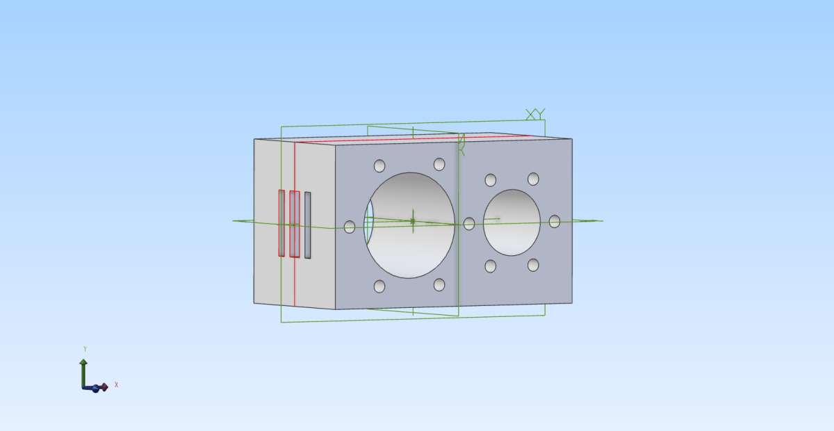
I managed to re-draw that block I think more or less as I’m supposed to although still had confusing antics with those rings of holes and the ports.
Finally I saved it as an Alibre Part drawing, then as a .jpg image, but when I tried to put the image below here it hogged almost the whole screen, hiding the entire forum window, so I had to start again and omit it.
.
Ironically, when I unwrapped the real block of iron I found the edges are so deeply radiused I might still end up with the LP cylinder cover overhanging the edges slightly. I re-tested the dimensions and they are correct, forced by the existing geometry. Then I realised judiciously unsymmetrical machining will move the worst effect from the top to the bottom of the block, where it sits on a steel box and the covers are mostly hidden by the plate-work.
Last night I turned to the engine’s part-drawn GA, started a few years ago on TurboCAD, and found I’m not out of the woods there either. I placed two parallel dimensions from the same point, over an inch different, but they returned the same value! TC grudgingly allows direct orthogonal work, but expects creating 3D models; creating hidden “work-plane” and co-ordinate problems. I may have to draw the GA manually as my source for drawing the simpler components in Alibre.
Finally I saved it as an Alibre Part drawing, then as a .jpg image, but when I tried to put the image below here it hogged almost the whole screen, hiding the entire forum window, so I had to start again and omit it.
Sounds like you opened the image in your browser by not dragging it correctly which will bring it up full screen and stop you seeing the page you had open (forum)
Yes all Cast Iron square and rectangular bar comes with rounded corners so you have to bear that in mind when working out what size you need to get the part out of.
I tried it again – no luck. The image opens in a full window. The photo tool tells you to “Drag, tap or click on it”. Tapping it by a mouse-click (? – I took it to mean the same as ‘click’ for taking the photo from a “smart”-‘phone.) did nothing, nor did ‘click’; and dragging it just opens it fully.
Might be something to do with using WIN-11, which does have weird and frankly unwelcome ways of controlling your photographs.
I realised the bar would have rounded corners but not quite as deeply as they are. I can work with it, with care. Well, I’ll have to. I considered modifying the original cylinder block but it might be more difficult than it looks.
You did not drag the image file to the box that comes up, watch this I first show how to do it and then what you probably did with that dodgy mouse of yours
I didn’t know you have to place the image in that box! It does not say “Drag… it to here”.
I was trying to put it in the message itself.
No, I’m not using that “dodgy mouse”, but a conventional one borrowed from one of my spare computers. I kept knocking the other off the table and it eventually broke!
Oh yes!
I think someone else was puzzled by this, wondering how to put text below the picture.
If I understand correctly [there’s a first time for everything] …
Nigel’s problem was that when inserting a large image into the forum, the image completely swamps the ‘composition pane’ … so you have no way of seeing what you are typing.
No Michael, if you watch my video from 0:40 you will see that (as Nigel has now confirmed) if you drag the image to anywhere else on the screen (reply box in his case) the image opens in a new browser tab and takes up the whole screen. You need to make sure the “drag here” box’s background turns a darker grey before releasing the mouse button. It is not a case of resizing a large image but simply dragging to the right place
Nigel, for typing after the image once it has been dragged and appears on the screen you are left with a flashing vertical line to the right of the image which is just a bigger one of what you see flashing as you type. So just like starting a new line of text all you need do it press the return (enter) key to take your cursor to the next line below the image and start typing. In this case what Michael says it a bit more likely as the flashing line may be harder to see at the right of alarge image but just hit return once the image shows up. It’s no different to how the old sytem worked or did not for those who ended up with a bit of text to the right of their image.
If in doubt and you can’t see the line then click on the image once it has appeared in the reply editor, then press the “end” key followed by return.
Main forum window goes dark, the “Drag…” box is bright.
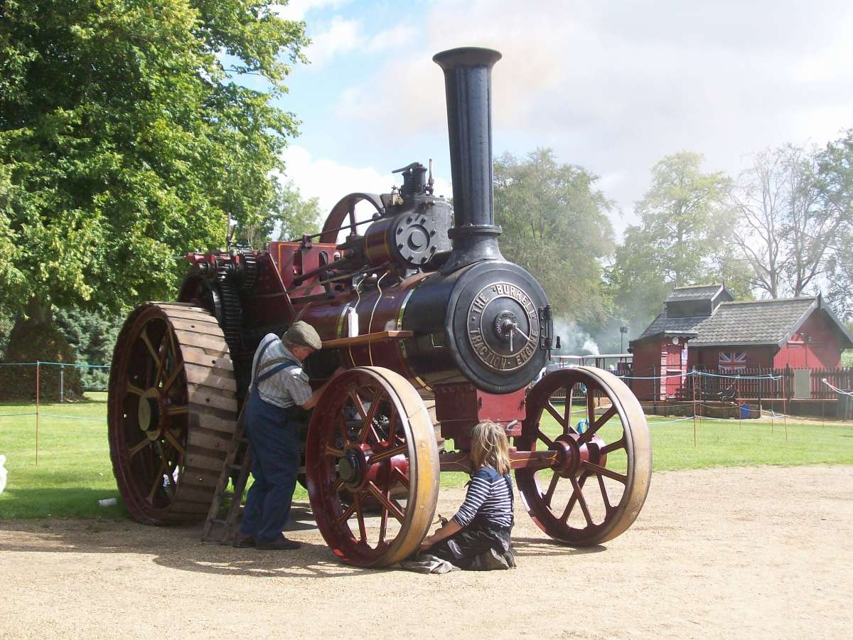
Pull in this photo (taken at Bressingham back in August) to the box, which obligingly goes grey around it. Release the mouse button and the photo appears here.
Now on my PC at least, the message box has a draw-bar down its own right-hand margin, a sideways one along the bottom, and a fully-opening arrow in the corner, a mysterious “P” that seems a highlighter; but no other controls on it.
Wind that bar down – or use the mouse wheel in the message – and I can go below the photo to add…
…. if I run the bar right down to the bottom and click on the border immediately under it, the cursor appears here and I can add this text or another photo with an intervening CRLF-key space. So..
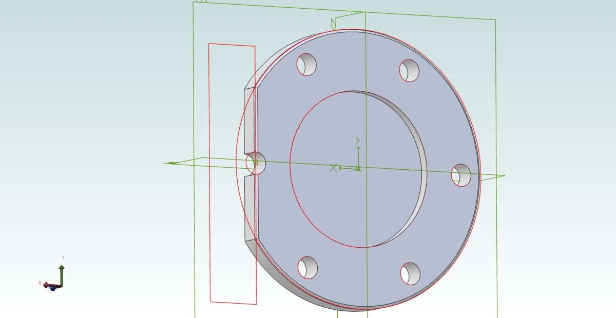
CRLF and same again… another jpeg image, and this time I can’t make it work:
The cursor this time seems to be in the picture!
So where was that sweet spot to step below the image?
Submit it, wait for the Forum to catch up (eeh, it’s slow!), see if I can edit it. I can, to add this line, but it’s still on the image. So Edit again…
To type: Let the software catch up! Perhaps that’s the secret. This text does seem now below that Alibre-jpg image; but so might the “The Cursor… in the picture” line be. I ought have used a picture with a more definite bottom edge.
Perhaps we’re having difficulties because the Forum runs more slowly that we expect. Watch the title-box up in the tool-bar, where a moving dot tries to hypnotise us while warning us all those 1s and 0s are being shuffled about.
Does not look to be on the image to me. That wis quite a wide but shallow image that fades to the forum colour at the bottom so hard to see what one starts and the other ends.
If you just click on the image you will briefly see a dotted line around it before it opens full size, as you will see dotted line is above the text
The magnolia is not you Nigel, the back room boffins have toned the white down, surprised no body has commented, they all seem quick to post comments about dislike of the bright the white