Interesting Curves

Advert

Interesting Curves

Home Forums Clocks and Scientific Instruments Interesting Curves

Viewing 19 posts - 1 through 19 (of 19 total)
  • Author
    Posts
  • #4037
    Michael Gilligan
    Participant
      @michaelgilligan61133
      Advert
      #659755
      Michael Gilligan
      Participant
        @michaelgilligan61133

        With thanks to Christiaan Huygens for discovering the Cycloid

        … and a nod of respect to all those who participated in the recent, somewhat lively, discussion.

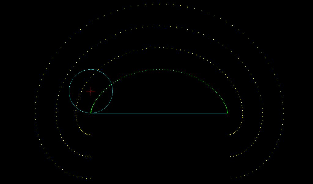
        Here is a screen-grab from a little exercise I have just done in QCAD

        .

        .

        First I created a ‘wheel’ with 96 spokes, then attached a green marker at one point on the circumference, and yellow markers at three more locations on a radial extension to that spoke. [thus mimicking what dave8 described]

        Then drew the circumference of the wheel, plus a ‘road’ of equal length on another layer, and hid the original wheel [to avoid cluttering the image]

        Grouping the four markers, and then copying that group ‘displaced & rotated’ to the other 95 positions produced four elegant curves … one of which is a Cycloid; but I know not what to call the others.

        .

        screenshot 2023-09-10 at 15.41.04.jpeg

        .

        MichaelG.

        .

        Discuss or ignore as you wish … My own curiosity is satisfied

        MichaelG.

        .

        Note: __ With hindsight, I don’t think creating the ‘spokes’ served any useful purpose … except to keep my mind focussed on what I was doing.

        .

        Edit: __ Apologies, I seem to have red dots where there should be yellow

        … can’t work-out what happened there blush but I will try to fix it.


        Edited By Michael Gilligan on 10/09/2023 17:02:05

        #659756
        Frances IoM
        Participant
          @francesiom58905

          page not found ? on my browser

          #659758
          Michael Gilligan
          Participant
            @michaelgilligan61133

            Definitely yellow in my Album

            **LINK**

            https://www.model-engineer.co.uk/wp-content/uploads/sites/4/images/member_albums/79913/927884.jpg

            … I did swap the picture : perhaps things are out of synch. now dont know

            Edited By Michael Gilligan on 10/09/2023 17:07:46

            Edited By SillyOldDuffer on 10/09/2023 17:11:40

            #659759
            Michael Gilligan
            Participant
              @michaelgilligan61133

              Thanks, Dave yes

              #659769
              david bennett 8
              Participant
                @davidbennett8

                Now, I wonder how that would look showing only the paths within a 10 degree swing – – – -?

                dave8

                #659778
                david bennett 8
                Participant
                  @davidbennett8

                  Michael, still just musing. Is it possible to put time-values on those dots and run a comparison within a 10 degee pendulum swing?  — just for fun!

                  dave8

                  Edited By david bennett 8 on 10/09/2023 18:37:07

                  #659779
                  Michael Gilligan
                  Participant
                    @michaelgilligan61133

                    You are welcome to a copy of my QCAD file if you want to investigate

                    … I certainly won’t be doing so

                    MichaelG.

                    .

                    Edit: __ for clarity: I have established to my satisfaction that the ‘extended rod’ curves are NOT cycloids

                    It doesn’t matter in the slightest  to me how close they might come dimensionally in any specific implementation.

                    Not a Cycloid = Not a Cycloid … that’s all there is to it.


                    Edited By Michael Gilligan on 10/09/2023 18:52:16

                    #659790
                    david bennett 8
                    Participant
                      @davidbennett8

                      Nor willI be doing it, even if Iknew how. I agree about the "purity"

                      dave8

                      #659793
                      Michael Gilligan
                      Participant
                        @michaelgilligan61133

                        yes

                        #659794
                        John Haine
                        Participant
                          @johnhaine32865

                          I think they are prolate trochoids, according to Philip Woodward.

                          #659798
                          Michael Gilligan
                          Participant
                            @michaelgilligan61133

                            Thanks, John

                            … complete with curlicues if we zoom out a bit:

                            **LINK**

                            https://www.proofwiki.org/wiki/Definition:Trochoid/Prolate

                            MichaelG.

                            #659805
                            Tony Jeffree
                            Participant
                              @tonyjeffree56510

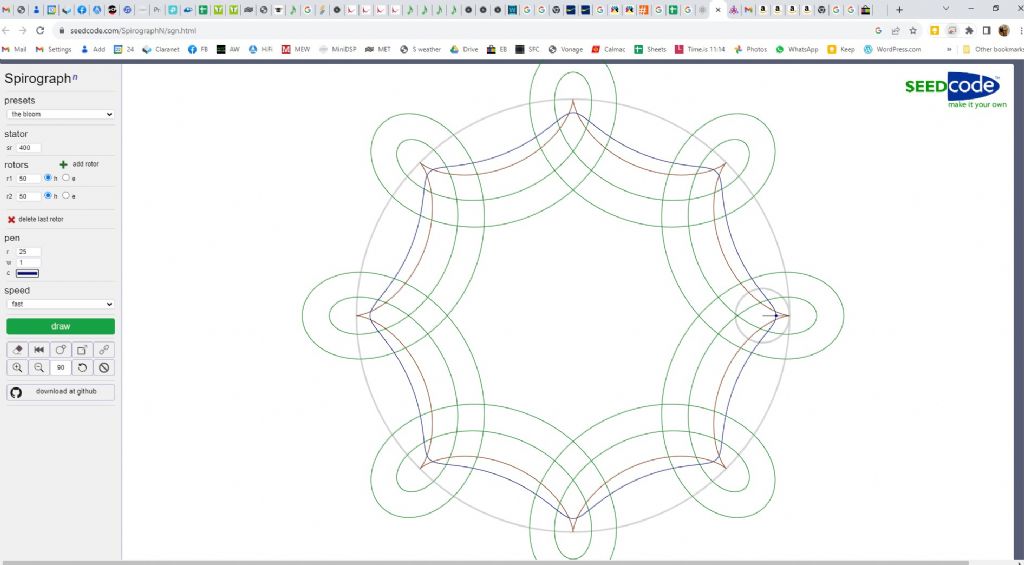
                              I discovered another "Spirograph" sim that allows drawing the path of points outside the rolling circle. Unfortunately it only allows you to draw the effect of a circle rolling round the inside of another, larger one, but a bit of mental straightening out of the containing circle gives you the idea.

                              cycloid 2.jpg

                              The red trace is of a point on the circumference of the rolling circle, so this is our familiar cycloid form. The blue trace is at half the radius of the rolling circle (R/2) – clearly not a cycloid. The two green traces are of a point at 2*R and 3*R – as shown in Michael's image above you get the "curlicues" added where the trace loops back on itself – again, clearly not cycloids. It is quite an amusing toy – https://seedcode.com/SpirographN/sgn.html

                              Edited By Tony Jeffree on 10/09/2023 22:13:15

                              #659807
                              duncan webster 1
                              Participant
                                @duncanwebster1

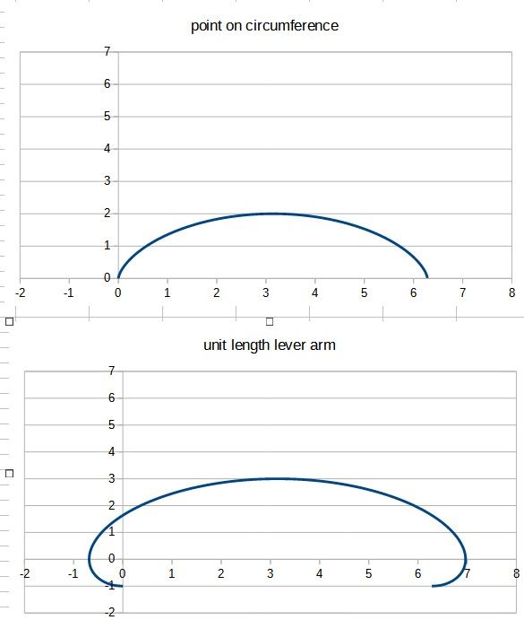
                                Here's Michael's curves generated by calculation in spreadsheet. Can't work out how to superimpose them, but they show the same behaviour. If you're wondering why, well there's nowt on the telly, it's a bit late to go in the workshop and SWMBO is on the phone to her brother.cycloids.jpg

                                #659808
                                david bennett 8
                                Participant
                                  @davidbennett8

                                  I don't know how to play! So i've got a real spirograph coming next week.

                                  #659818
                                  Michael Gilligan
                                  Participant
                                    @michaelgilligan61133
                                    Posted by duncan webster on 10/09/2023 22:33:12:

                                    Here's Michael's curves generated by calculation in spreadsheet. […]

                                    .

                                    That’s very neat, Duncan yes

                                    I must confess that I’ve never got to grips with graphing in spreadsheets

                                    … Grateful if you could provide a brief description of how it was done.

                                    MichaelG.

                                    #659859
                                    duncan webster 1
                                    Participant
                                      @duncanwebster1

                                      I think if this morphs into an Excel tutorial we might get complaints. Very briefly, arrange the X values in one column, and the Y values in an adjacent column, with their row numbers aligned. Select these 2 blocks of values using mouse, then from toolbar at the top insert/chart/X-Y scatter/points only/smooth. To have more than one set of y values, just select more data. It wants to use the left hand data as X you might be able to change that, but not sure how.

                                      It gives you options to add labels to the whole chart and the axes and other clever things. I've got an old book about Excel upstairs (and I mean old, but it hasn't altered much). I could lend it to you if you like, PM me your dirt mail address.

                                      #659862
                                      John Haine
                                      Participant
                                        @johnhaine32865

                                        Two things to add to Duncan's excellent description.

                                        If you want to plot two Y variables against one X, put them in adjacent columns to the right. You can add column titles (say "time, amplitude, period&quot at the top of each column and select the titles as you select the columns.

                                        If you choose the line option in the insert/… command it will plot a line through your points.

                                        #659869
                                        Michael Gilligan
                                        Participant
                                          @michaelgilligan61133
                                          Posted by duncan webster on 11/09/2023 13:23:10:

                                          I think if this morphs into an Excel tutorial we might get complaints. Very briefly, arrange the X values in one column, and the Y values in an adjacent column, with their row numbers aligned. Select these 2 blocks of values using mouse, then from toolbar at the top insert/chart/X-Y scatter/points only/smooth. To have more than one set of y values, just select more data. It wants to use the left hand data as X you might be able to change that, but not sure how.

                                          It gives you options to add labels to the whole chart and the axes and other clever things. I've got an old book about Excel upstairs (and I mean old, but it hasn't altered much). I could lend it to you if you like, PM me your dirt mail address.

                                          .

                                          Thanks for the offer, Duncan yes … much appreciated

                                          I am, however, currently sinking in the quicksand whilst trying to rework some survey drawings in preparation for a planning application, and wouldn’t have time to study it this side of Christmas !!

                                          With your notes and John’s I am already pointed in the right general direction thanks …

                                          All I would ask for now is could you please let me have a copy of your file ?

                                          I am likely to try it in Apple’s ‘Numbers’ which, although it has its own idiosyncratic style will happily open .xls

                                          … I will send you a P.M.

                                          MichaelG.

                                        Viewing 19 posts - 1 through 19 (of 19 total)
                                        • Please log in to reply to this topic. Registering is free and easy using the links on the menu at the top of this page.

                                        Advert

                                        Latest Replies

                                        Viewing 25 topics - 1 through 25 (of 25 total)
                                        Viewing 25 topics - 1 through 25 (of 25 total)

                                        View full reply list.

                                        Advert

                                        Newsletter Sign-up