NEW LOOK COVER FOR MEW

Advert

NEW LOOK COVER FOR MEW

Home Forums Model Engineers’ Workshop. NEW LOOK COVER FOR MEW

Viewing 25 posts - 1 through 25 (of 85 total)
  • Author
    Posts
  • #604509
    Neil Wyatt
    Moderator
      @neilwyatt

      We're hard at work making Model Engineers' Workshop the best source for hobby engineers, makers and modellers in the business and WE NEED YOUR HELP!

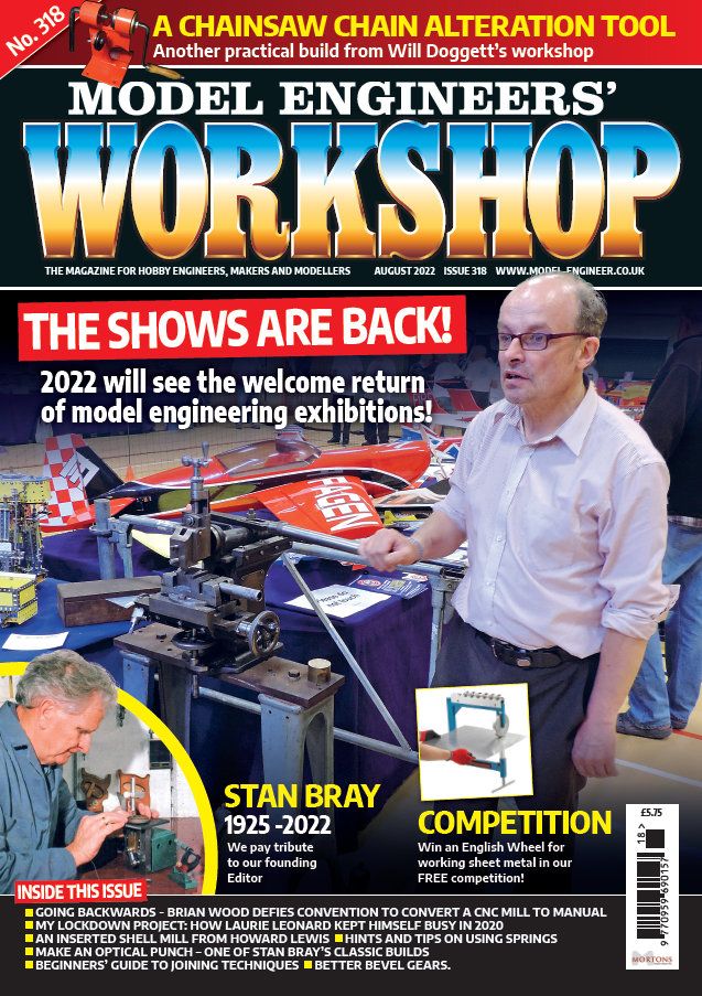
      Have a look at the cover to our upcoming issue, No 318, Aug-22 issue. What do you think? What's good? What's bad? If you could choose anything, what would you like to see in pride of place on the front page?

      mew 318.jpg

      Any feedback on the cover to: meweditor@mortons.co.uk

      This issue is on-sale 22-Jul-22, pre-order from here.


      Edited By Darren H on 06/07/2022 12:19:21

      Edited By Darren H on 06/07/2022 12:20:18

      Advert
      #38666
      Neil Wyatt
      Moderator
        @neilwyatt

        TELL US WHAT YOU THINK

        #604512
        JasonB
        Moderator
          @jasonb

          Maybe a few less balding and grey haired people on the covers would bring in a newer reader. devil

          317s cover was not much good as the writing covered the only slightly technical bit with the clear area just showing someone's back and side, don't know if it was meant as click bait or just getting the female balance up to keep it WOKE. Would have been better to show someone in the background behind a 3D printer.

          As for 318, I think a few larger headings like the yellow ones would be better than the small stuff along the bottom, anyone picking it up in a newsagent will flick to the contents page to see that. You often don't see the lower half of the mags anyway when stacked in multi tear displays.

          #604515
          Kiwi Bloke
          Participant
            @kiwibloke62605

            For me, the content is more important than the cover. There's currently rather a lot of evidence that more resources should be applied to editing, rather than fiddling with packaging.

            #604516
            Roderick Jenkins
            Participant
              @roderickjenkins93242

              Looks a bit fussy to me. Glad to see that the main title is still supporting Ukraine wink

              Rod

              #604518
              Nick Wheeler
              Participant
                @nickwheeler

                It's a mess:

                too many horizontal lines breaking up the page.

                that's made even worse by the captions and pictures that aren't horizontal

                far too many extra words in tiny fonts that repeat the captions

                what is the picture supposed to show? It looks like I took it, and my photography is almost as bad as my singing

                english wheels are great machines, but why is he wearing one as a cod piece?

                #604520
                JohnF
                Participant
                  @johnf59703

                  The issue number [No 318 on the photo] use one colour set for all copies BUT a different colour for the copy that has the series index in thus its easy to find this copy from "the pile" — say black type on yellow background.

                  John

                  #604521
                  JasonB
                  Moderator
                    @jasonb

                    If you are trying to make it "the best source for hobby engineers, makers and modellers in the business" then reduce the Model Engineer and increase the other bit in size

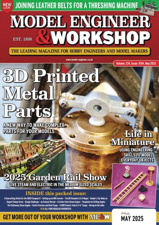
                    mew.jpg

                    #604523
                    Gary Wooding
                    Participant
                      @garywooding25363

                      The cover content is fine for me: what I don't like is the high gloss finish. Its too slippery.

                      #604524
                      Ches Green UK
                      Participant
                        @chesgreenuk

                        Neil,

                        Most of the Comments above kinda hit the nail on the head….the cover is way too fussy, and there is no clear Content message(s).

                        Very few magazines get this right. Have a go at Google'ling 'magazines' and look at the 'Images' results … only a few of the Covers catch the eye and makes one curious about what is inside….the rest look like a bit of a dog's breakfast.

                        And as Jason has neatly pointed out, the word 'Workshop' is way too dominant on the cover…it should be pushed back, a bit.

                        All the above is meant as constructive … I really appreciate the work you and the team do in readying the magazine.

                        Ches

                        #604534
                        Bazyle
                        Participant
                          @bazyle

                          I think the small writing on contents at the bottom is usefull in two years when looking for that issue that had the optical punch.

                          I have pointed out before that the cover picture is important real estate for showing a picture of a model or project that is covered inside – not to be wasted on pictures of people.

                          The number tab at the top left is good for helping find a particular issue in a pile of magazines, so much better than a number in a tiny font somewhere in the clutter. It would be nice to put 'JUNE 22' next to it for when somebody tells you in five years that an item of interest was at a particular date, not knowing the issue number.

                          #604537
                          Graham Meek
                          Participant
                            @grahammeek88282

                            Nice to see white writing on a black background.

                            Red and Green writing over a photograph is not seen by me, and it plays havoc with my eyes, not to mention the Migraine this combination induces.

                            Regards

                            Gray,

                            #604538
                            JA
                            Participant
                              @ja

                              To me it does not matter what the cover looks like. It could be brown wrapping paper with the title pencilled on it.

                              Surely the cover is eye candy, there to do only one thing, to catch the eye of the casual buyer and hook him or her. Considering the interests of this forum's membership I would reduce the emphasis on model engineering.

                              JA

                              Edited By JA on 06/07/2022 10:55:41

                              #604545
                              Peter G. Shaw
                              Participant
                                @peterg-shaw75338

                                I think that on the whole it is too messy especially with the white lines separating the sections.

                                The Issue Number looks too small compared with previous issues, possibly making it more difficult to read when quickly glancing through looking for a particular issue. I’m not sure that moving the Issue Date adjacent to the Issue Number is particularly helpful, but then if I’m searching for an article I always go by the Issue Number as this is how my home database is organised.

                                I’m not sure that changing the relative sizes of “Model Engineer’s” and “Workshop” is really necessary. When all said and done, the magazine is not an alternative to “Model Engineer” and I think that having “Workshop” writ large helps to emphasize that point. Sorry Jason.

                                On the same lines, I think the top line, (Strap Line?) was fine as it was as it helps to differentiate MEW from ME. Plus the actual text used emphasizes who it’s aimed at.

                                To be honest, I’m a bit like Kiwi Bloke – I generally don’t look at the cover, other than the Issue Number, so it could theoretically be blank for me. As regards the young lady on Issue 317, well, is she young? How can you tell? But anyway, what’s wrong with it? I know historically the hobby has been the province of mainly elderly gentlemen, and we all know the reasons why, but why not have a few photos of the fairer sex? (Am I now in hot water for that phrase? Don’t care anyway.) Let’s show that workshop engineering is NOT the province of elderly men in dirty greasy overalls smelling of suds, or smoke, or whatever.

                                On the other hand, maybe I’m just an old fuddy-duddy.

                                Peter G. Shaw

                                #604552
                                Circlip
                                Participant
                                  @circlip

                                  Cover and internal pages glossy cos the paper doesn't absorb the ink, easier to wash the paper pulp for recycling. You can still smudge the early MEWs.

                                  Regards Ian.

                                  #604554
                                  JasonB
                                  Moderator
                                    @jasonb
                                    Posted by Ches Green UK on 06/07/2022 10:01:42:

                                    And as Jason has neatly pointed out, the word 'Workshop' is way too dominant on the cover…it should be pushed back, a bit.

                                    I am happy with the size of "workshop" it's who it is aimed at that I felt needed changing as "Model Engineers" dominates yet Neil said he is aiming at "hobby engineers, makers and modellers" so that should be larger

                                    #604565
                                    Nicholas Farr
                                    Participant
                                      @nicholasfarr14254

                                      Hi, well no disrespects to anyone, but the shaping machine has more interest than the guy holding the handle, sorry! and I agree with JasonB's comments about 317 and about the yellow headings rather than the ones at the bottom. I also don't think the chainsaw heading should be before the magazines name and was better with the slogan about the magazine being for hobby engineers etc. I'm like Peter G. Shaw and think the issue number should remain the same size as it has been for a long time, there was an outcry about that not being there once and also just being a little number.

                                      Regards Nick.

                                      #604568
                                      Frances IoM
                                      Participant
                                        @francesiom58905

                                        I suspect I’m not alone in buying the magazine for the workshop/machine tool aspects and certainly prefer illustrations of such – I realise that young women in completely inappropriate costume ‘draped’ over motor bikes was the norm in the past but making even middle aged men the focal point of the cover detracts from my interest – just concentrate on the machine or the workshop.

                                        #604570
                                        Baz
                                        Participant
                                          @baz89810

                                          Don’t Morton’s Media employ graphic artists / designers, personally I think this is extracting the urine.

                                          #604571
                                          Nick Clarke 3
                                          Participant
                                            @nickclarke3

                                            I now get MEW on subscription so this suggestion no longer applies to me but the magazine is usually on the bottom shelf at the back in those High St newsagents who stock it. Thus the title can't be at the top of the page or so low down so as to be hidden so it is good in the present position – but if one casts caution to the winds and kneels down, hoping that getting up again is a possibility, the headline above the title is about a chainsaw tool. i don't have a chainsaw so this would not persuade me to buy – and perhaps not even take the magazine out to read the rest of the front page as the only other visible item is that shows are back – and I knew that already.

                                            Whereas the Stan Bray obit, the competition or even 'In this issue' would all draw me in to read further so they would be good above the title.

                                            But as I say – I have a subscription now.

                                            #604572
                                            Andrew Tinsley
                                            Participant
                                              @andrewtinsley63637

                                              I don't want to be a Luddite, but the "New Cover" does look an awful mess. Too many things trying to claim attention and too many human's about and not enough interesting machinery and product. The whole thing needs to be simplified AND carry a message as to what it is all about.

                                              Andrew.

                                              #604574
                                              Ches Green UK
                                              Participant
                                                @chesgreenuk

                                                …bottom shelf …I have a subscription now.

                                                Good points.

                                                If 90% of sales are via subscription then, to some extent, the cover could be brown paper and it wouldn't affect sales too much

                                                But, if sales are 50:50 (ie subscription:magazine shops/airports etc) then the magazine cover becomes an important selling tool for irregular and newcomer buyers.

                                                I have a subscription.

                                                I think it is right of Neil to ask for feedback.

                                                Ches

                                                #604583
                                                Mark Rand
                                                Participant
                                                  @markrand96270

                                                  Mayhap if 'twer covered in brown paper and placed on the top shelf, it would attact more sales. laugh

                                                  #604588
                                                  Tim Stevens
                                                  Participant
                                                    @timstevens64731

                                                    And – at last a chance that someone might listen – NOT SLIPPERY. The last thing we need in our cluttered workshops as we follow an article is the magazine slipping from the bench into a pile of oily swarf on the floor. Ditto when reading in bed what we intend to try tomorrow.

                                                    Someone will say 'Oh, it wipes clean' but I remind you it should not get itself dirty.

                                                    There is one thing which is better on the example shown – no locomotives to be seen. Makes a welcome change.

                                                    Cheers, Tim

                                                    #604589
                                                    JasonB
                                                    Moderator
                                                      @jasonb

                                                      Do you actually look at the covers or just feel them Tim? Last one with a loco on it was No266, smile d You may be thinking of ME.


                                                      In fact only 3 out of 318 issues of MEW have a loco on the front. And only about 25% of ME over the last couple of years have a Loco on the front


                                                      Edited By JasonB on 06/07/2022 16:19:59

                                                    Viewing 25 posts - 1 through 25 (of 85 total)
                                                    • Please log in to reply to this topic. Registering is free and easy using the links on the menu at the top of this page.

                                                    Advert

                                                    Latest Replies

                                                    Viewing 25 topics - 1 through 25 (of 25 total)
                                                    Viewing 25 topics - 1 through 25 (of 25 total)

                                                    View full reply list.

                                                    Advert

                                                    Newsletter Sign-up