Inroducing lathes article in 303
Inroducing lathes article in 303
- This topic has 17 replies, 11 voices, and was last updated 27 April 2021 at 16:24 by
 Howard Lewis.
 readers.

- Please log in to reply to this topic. Registering is free and easy using the links on the menu at the top of this page.
Latest Replies
-
- Topic
- Voices
- Last Post
-
-
3/16″ lathe chuck key wanted
Started by:
Wink Hackman
in: Workshop Tools and Tooling
- 10
-
12 March 2025 at 08:24
Nicholas Farr
-
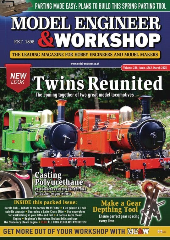
NEW LOOK – Model Engineer & Workshop
1
2
…
6
7
Started by:
sohara
in: Model Engineer & Workshop
- 55
-
12 March 2025 at 08:23
Diogenes
-
Where/How will you be watching ?
Started by:
Michael Gilligan
in: Clocks and Scientific Instruments
- 1
-
12 March 2025 at 07:21
Michael Gilligan
-
Forthcoming improvements in White LEDs
Started by:
Michael Gilligan
in: Electronics in the Workshop
- 1
-
12 March 2025 at 06:57
Michael Gilligan
-
Mobile workshop
Started by:
Sonic Escape
in: The Tea Room
- 12
-
12 March 2025 at 06:50
Diogenes
-
Farm Boy
1
2
3
4
Started by:
Dalboy
in: I/C Engines
- 15
-
12 March 2025 at 05:57
Michael Gilligan
-
Myford 254s
Started by:
dt-tech
in: Manual machine tools
- 3
-
12 March 2025 at 04:50
Howard Lewis
-
FB2 Clone – aligning the column
Started by:
Diogenes
in: Manual machine tools
- 11
-
12 March 2025 at 04:44
Howard Lewis
-
Identify
Started by:
melvsals
in: Introduce Yourself – New members start here!
- 1
-
11 March 2025 at 23:33
melvsals
-
Su251-53
Started by:
parovoz
in: Locomotives
- 6
-
11 March 2025 at 23:04
Dalboy
-
Another Fobco Chuck
Started by:
spencerd72
in: Workshop Tools and Tooling
- 5
-
11 March 2025 at 21:54
Chris Crew
-
Morse Key
Started by:
Steve Withnell
in: Work In Progress and completed items
- 7
-
11 March 2025 at 21:27
rjenkinsgb
-
Firth Valve Gear
Started by:
Andy Stopford
in: Traction engines
- 6
-
11 March 2025 at 21:07
Andy Stopford
-
Just got my first loco – advice on consumables/accessories
Started by:
Beardy Mike
in: Beginners questions
- 6
-
11 March 2025 at 21:02
noel shelley
-
Readability / clarity in new combined magazine
Started by:
Trevor Gale
in: Model Engineer & Workshop
- 7
-
11 March 2025 at 20:29
Clive Foster
-
Lathe cutting a taper
Started by:
Chris Mate
in: Beginners questions
- 4
-
11 March 2025 at 20:26
Michael Gilligan
-
Chips away! First cut
Started by:
Dave S
in: CNC machines, Home builds, Conversions, ELS, automation, software, etc tools
- 3
-
11 March 2025 at 20:19
Michael Gilligan
-
Cheap MMA inverter (aka stick welder)?
Started by:
Fulmen
in: Workshop Tools and Tooling
- 4
-
11 March 2025 at 18:37
Fulmen
-
Model steam marine boiler
Started by:
raindancer
in: Help and Assistance! (Offered or Wanted)
- 4
-
11 March 2025 at 17:32
raindancer
-
Discussion on the Future Direction of Model Engineer and Workshop
1
2
…
11
12
Started by:
Neil Wyatt
in: Model Engineer.
- 72
-
11 March 2025 at 16:27
David Standing 1
-
Mystery casting
Started by:
Phill Spowart
in: General Questions
- 4
-
11 March 2025 at 16:16
bernard towers
-
Fritz Werner Universal Mill
Started by:
Bob
in: Manual machine tools
- 4
-
11 March 2025 at 14:58
sjoerd981
-
Southworth valve setting
Started by:
John Lawson
in: Help and Assistance! (Offered or Wanted)
- 3
-
11 March 2025 at 13:05
Martin Johnson 1
-
gears design and machining
Started by:
jacques maurel
in: Suggested Online Resources
- 1
-
11 March 2025 at 11:16
jacques maurel
-
The Decline of Model Engeneering Workshop
1
2
Started by:
Paul Lousick
in: General Questions
- 22
-
11 March 2025 at 11:15
JasonB
-
3/16″ lathe chuck key wanted