Wallis & Steevens Water Cart in 1′ scale

Advert

Wallis & Steevens Water Cart in 1′ scale

Home Forums Work In Progress and completed items Wallis & Steevens Water Cart in 1′ scale

Viewing 16 posts - 1 through 16 (of 16 total)
  • Author
    Posts
  • #513995
    Richard S2
    Participant
      @richards2


      I'm getting close to the top coat stage of this scratch build project now.

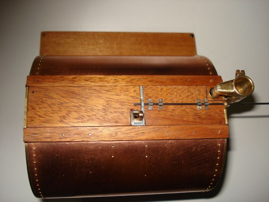
      Complied with the early original design option of using wood for the top areas and tank lid. I've used mahogany where they probably used elm?-

      dsc02270.jpeg

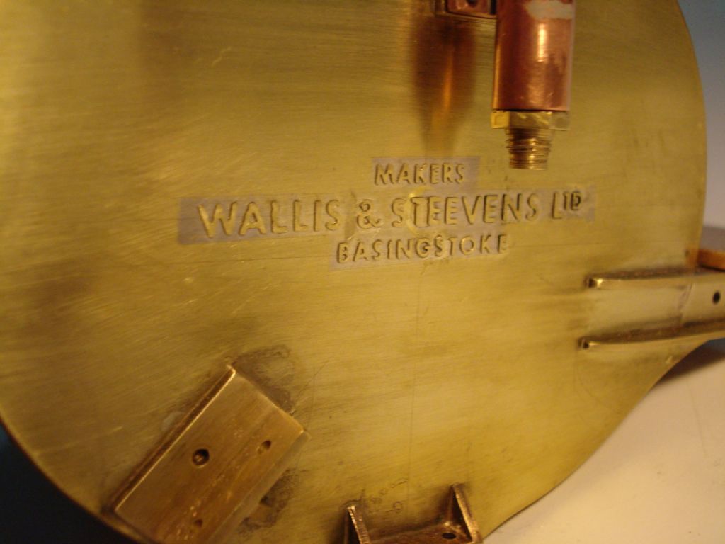
      I was glad to get past the job of soldering the individual letters onto the tank end plates-

      dsc02272.jpeg

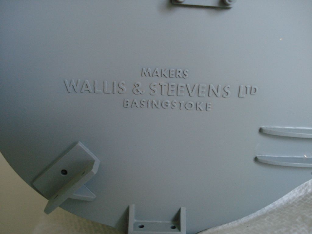
      Not perfect, as a couple of letters had moved slightly and I had to make the Ampersands (& ) from bits in 3mm height lettering, but hopefully won't show from behind the wheels. A reasonable representation of the 'cast in' pattern of the original and looks better after a coat of 2 part etch primer-

      dsc02277.jpeg

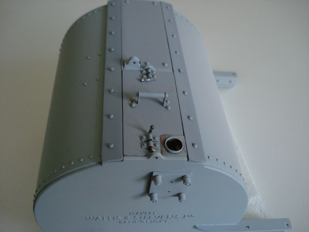
      Most of the tank lid furniture is made from nickel silver and fixed with 1/32" rivets-

      dsc02278.jpeg

      More finishing to do on the woodwork, then it's ready for the drab matt green top coat.

      There are several images in my album which covers the work up to now if interested.

      I'll add to this 'thread' as I progress from now and will be dependant on progress of the painting and assembly of my 1' modded Minnie, to which this Cart will be attached to.

      Regards

      Edited By Richard S2 on 17/12/2020 13:30:49

      Advert
      #31334
      Richard S2
      Participant
        @richards2
        #514012
        William Chitham
        Participant
          @williamchitham75949

          That's beautiful. Are the letters commercially available or did you make them somehow and looking at the album how did you do the wheel hubs, are they cast?

          William.

          #514023
          Dalboy
          Participant
            @dalboy

            Great workmanship I just looked through what you had done to get to this stage and it does seem a shame to have painted it, but when you are trying to get it looking like the original I understand why.

            #514026
            Jeff Dayman
            Participant
              @jeffdayman43397

              Top notch work Richard!

              #517092
              Richard S2
              Participant
                @richards2

                Thanks all for the positive responses. I replied to William via PM same day.

                Posted by Derek Lane on 17/12/2020 16:24:14:

                Great workmanship I just looked through what you had done to get to this stage and it does seem a shame to have painted it, but when you are trying to get it looking like the original I understand why.

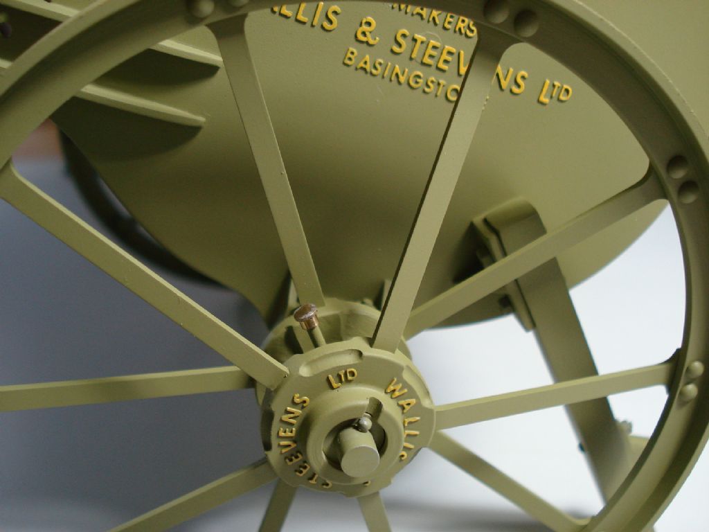
                Yep!, bit of a shame Derek, but needs must. Made fair progress on the main paint and picked out the raised lettering. Rather intense concentration trying to paint these with a 6 bristle sable brush and a x5 dioptra Loupe. This is the only pic at the moment-

                dsc02291.jpeg

                Need to get some more matt varnish for final coat before proper assembly. Reasonably pleased with the finish considering my tired old Airbrush (Badger 200) is now 45 years old.

                Regards

                #517227
                Tim Stevens
                Participant
                  @timstevens64731

                  The only comment I make on your lettering is this: To anyone versed in the history of lettering design, the style you have chosen does not match the date of the original. Unless of course, your water cart was made after about 1927. In typeface terms, it might be Futura, or Spartan, or one or two others – I would need to see other letters to be more certain.

                  I wonder if there is enough interest in this 'arcane corner' of design history (from an ME point of view) for an article about matching the letters to the job?

                  Regards – Tim (who once, long ago, designed typefaces for Amstrad)

                  #517228
                  Tim Stevens
                  Participant
                    @timstevens64731

                    Sorry – twice again!

                    Tim

                    Edited By Tim Stevens on 03/01/2021 14:57:28

                    #536351
                    Richard S2
                    Participant
                      @richards2

                      Thank you for your observations/contribution.

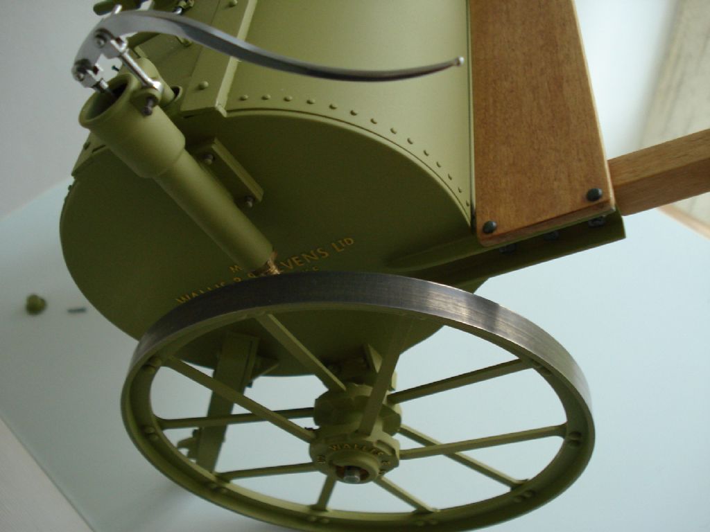
                      So continuing with this reasonable representation of the brand's model, I managed to dull the finish on the shiny wheel tread faces and now seem to look better-

                      337128b3-013c-4613-a93b-46853d68489a.jpeg

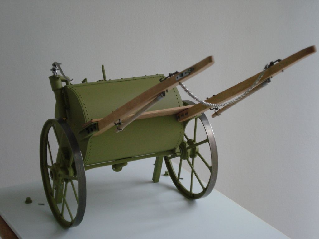
                      Nearly finished, and just the Drawabar to make that will replace the shafts. It can then be hooked up to the Modded Minnie TE-

                      64c69e63-0470-4c00-8150-cc68d1b8f7a9.jpeg

                      #571146
                      Richard S2
                      Participant
                        @richards2

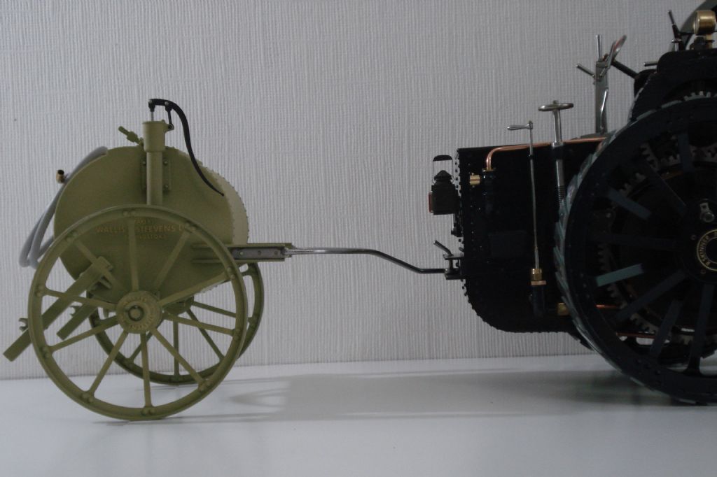
                        Now the Minnie T/Engine is back in one piece on 'all fours', I've finished fabricating the alternative drawbar for this cart. Trial fit –0620f517-f7b0-4793-a305-a7a7becec7b2_1_201_a.jpeg

                        Just the painting of the drawbar and some plumbing/hose parts to do and it will be finished.

                        #571147
                        SillyOldDuffer
                        Moderator
                          @sillyoldduffer
                          Posted by Tim Stevens on 03/01/2021 14:56:49:

                          The only comment I make on your lettering is this: To anyone versed in the history of lettering design, the style you have chosen does not match the date of the original. …

                          I wonder if there is enough interest in this 'arcane corner' of design history (from an ME point of view) for an article about matching the letters to the job?

                          Regards – Tim (who once, long ago, designed typefaces for Amstrad)

                          I've dabbled trying to recreate realistic period signage with Inkscape and found it to hard to identify modern fonts to do authentic ye olde lettering, for 3D and ordinary paper printing. I found it necessary to mix and match letters from various fonts, and to individually modify certain characters and punctuation by editing the splines of the underlying glyphs. Tedious and imperfect.

                          Although I suspect many early cast-metal signs used home-made fonts that don't match anything standard exactly, I'm certain part of the problem was my general ignorance of font families and not knowing how styles changed over time.

                          Any advice on finding or making period correct fonts would be most welcome.

                          Dave

                          #571168
                          Harry Wilkes
                          Participant
                            @harrywilkes58467

                            Nice work

                            H

                            #571169
                            Michael Gilligan
                            Participant
                              @michaelgilligan61133
                              #571260
                              Richard S2
                              Participant
                                @richards2
                                Posted by Michael Gilligan on 13/11/2021 18:24:30:

                                Good specimen of the appropriate font, here: **LINK** MichaelG.

                                Thank you. I did use images of full sized examples for research initially and my available stock of lettering was close enough for me.

                                I had no intention of making more lettering to a presupposed idea of what it may have looked like around 1900.

                                So for anyone who is bothered by it, can peruse the images of a full size Cart example on this – LINK – for another comparison. I can't post them (or others) into this Topic, as they are copyrighted.

                                #571262
                                Dalboy
                                Participant
                                  @dalboy

                                  They look close enough to me a good job Richard. Many times when modeling something if it is built to exact scale it just does not look right so a little artistic licence is required to make it look correct.

                                  #571364
                                  Michael Gilligan
                                  Participant
                                    @michaelgilligan61133
                                    Posted by Richard S2 on 14/11/2021 13:18:06:

                                    Posted by Michael Gilligan on 13/11/2021 18:24:30:

                                    Good specimen of the appropriate font, here: **LINK** MichaelG.

                                    Thank you. I did use images of full sized examples for research initially and my available stock of lettering was close enough for me.

                                    I had no intention of making more lettering to a presupposed idea of what it may have looked like around 1900.

                                    […]

                                    .

                                    No criticism from me, Richard !

                                    … I think you’ve done a superb job.

                                    MichaelG.

                                  Viewing 16 posts - 1 through 16 (of 16 total)
                                  • Please log in to reply to this topic. Registering is free and easy using the links on the menu at the top of this page.

                                  Advert

                                  Latest Replies

                                  Viewing 25 topics - 1 through 25 (of 25 total)

                                  Viewing 25 topics - 1 through 25 (of 25 total)

                                  View full reply list.

                                  Advert

                                  Newsletter Sign-up